The Fairview Renovation Project
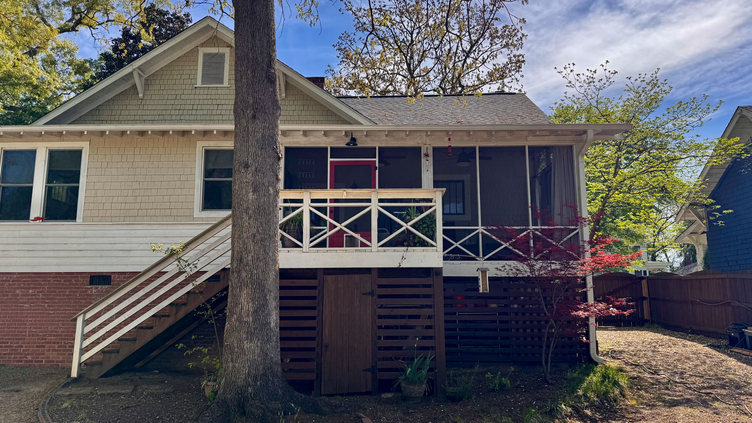
We love this sweet home called the Fairview Renovation Project. It is historic and charming and perfectly reflects the personalities our of clients. And goodness, we had a lot of fun with this project.
The Background Story
A very kind realtor reached out to see if I could help her clients envision what this house could look like with a few changes. So, we met at the house and I cast my vision for the home, and her clients quickly became mine too! The most interesting part about this project is that my clients were moving here from out-of-state so the only interaction we would have during the bulk of the renovation would be through emails and text/phone. We would basically be renovating the home without them which is equal parts scary and exciting. We accepted the challenge including a tight five-week timeline to get the major items completed so that they could move in before their new jobs started. No pressure, right?
The good news was that the house was in pretty good shape overall. All of the walls had been recently painted and the major items – electrical, roof, HVAC – all checked out during the home inspection. That allowed us to focus on a few specific areas they most wanted updated.
The Renovations
Kitchen
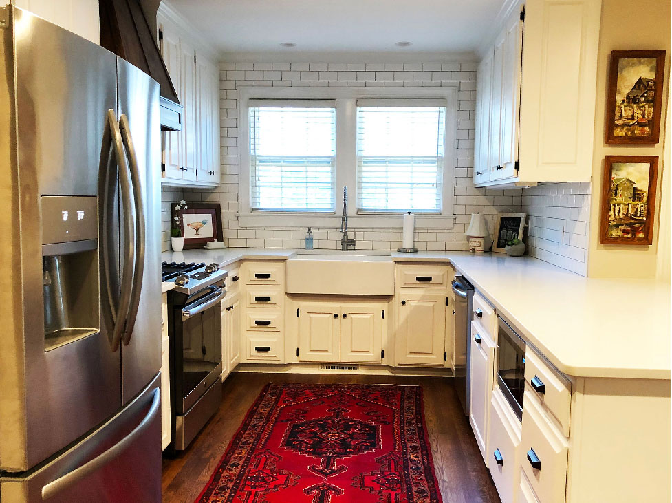
We first focused on the kitchen. While it wasn’t a bad kitchen, it was dated and had a somewhat weird eating area from a prior renovation. Overall it just lacked character so we got to wok on creating something special for our clients.
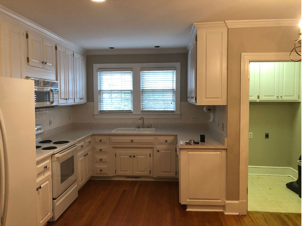
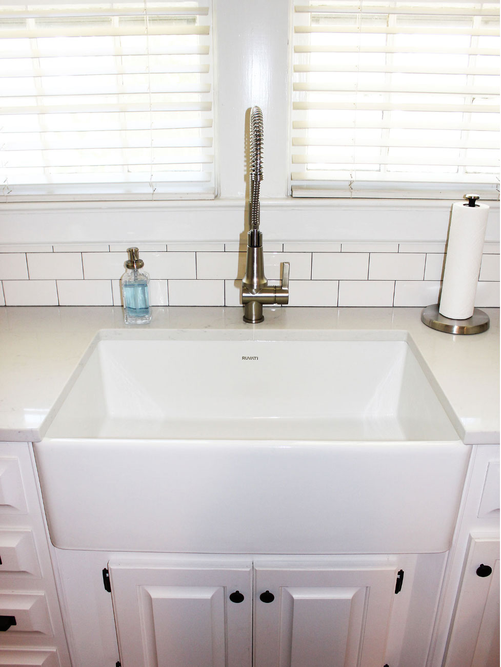
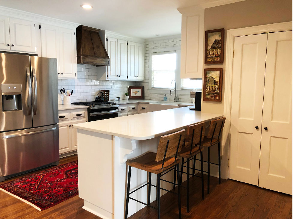
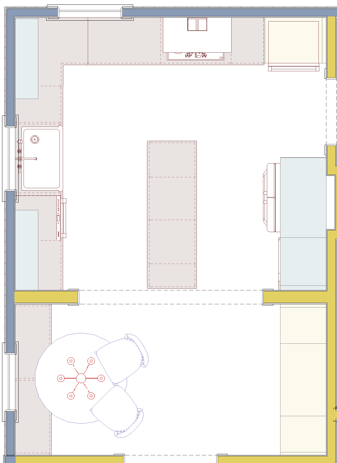
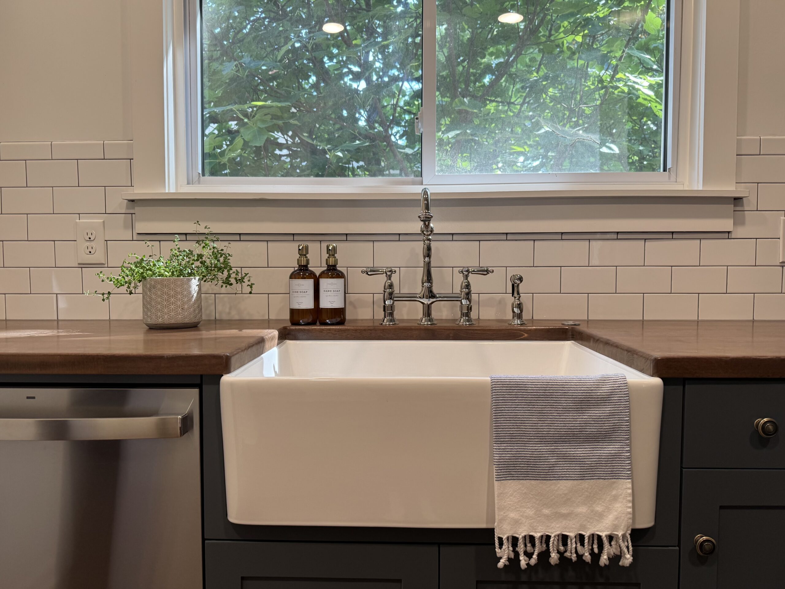
To keep costs down, we chose to keep the existing kitchen cabinets and simply make modifications to them to make this kitchen work better for our clients. First, a farmhouse sink was added after the guys modified the sink existing base. This sink was high on the priority list for my clients and the stainless steel commercial sink compliments it well.
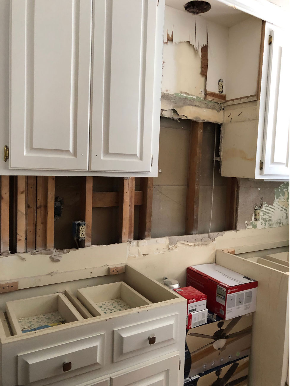
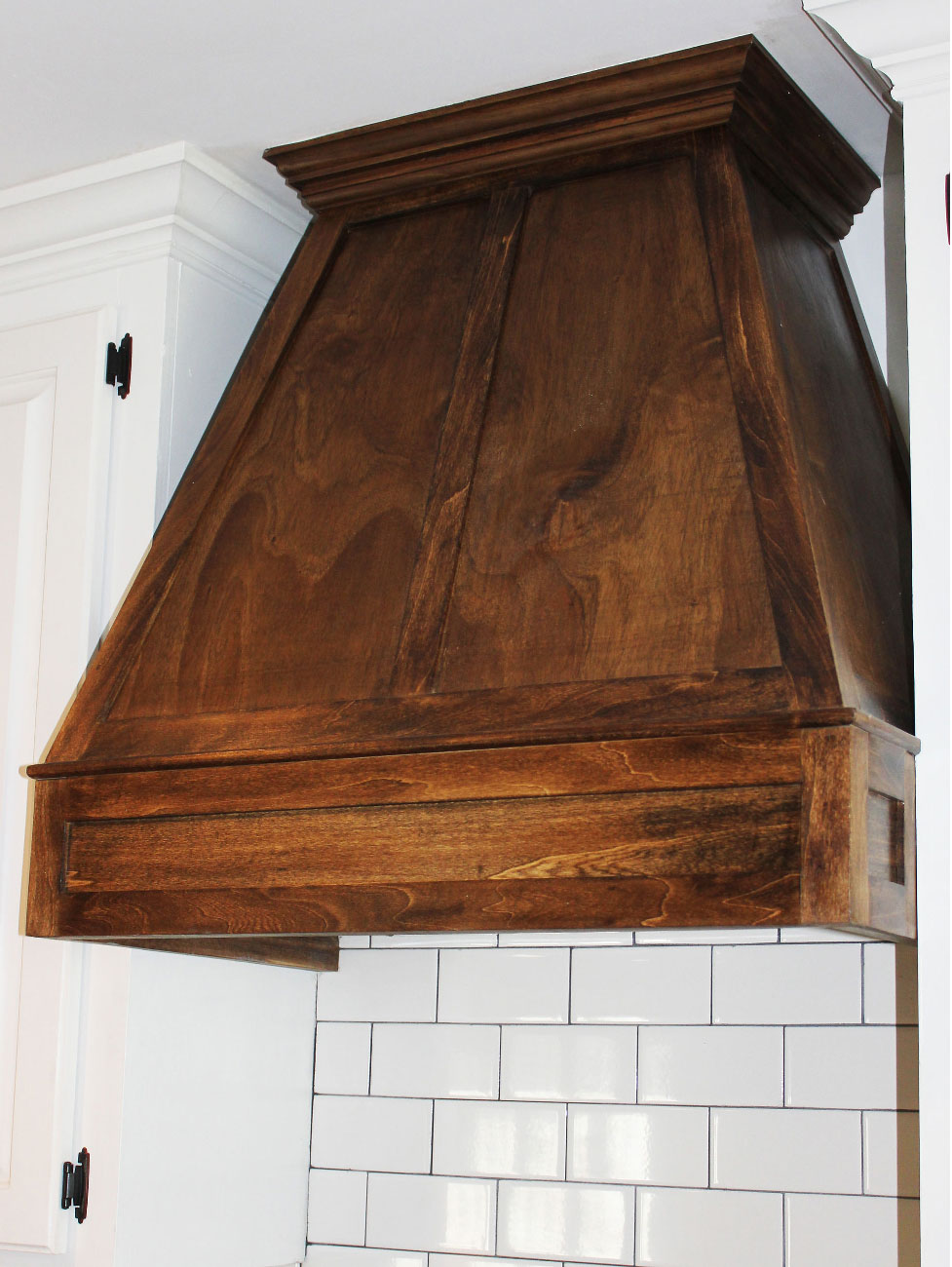
Second, we removed the microwave hood and the cabinet above it to make way for a custom stained wood hood which really breaks up the wall of cabinetry.
We then had the cabinet guys make a 6′ island to match the existing cabinets and relocated the microwave to there along with a trash pull-out. This allowed us to make room for bar seating and somehow made the room feel twice as large. We finished off the kitchen with new quartz countertops, replaced the cabinet hardware with oil-rubbed bronze to contrast with the cabinets, and added a classic subway tile backsplash with gray grout all the way to the ceiling behind the sink. I mean seriously, who wouldn’t want to spend time in this kitchen?
Master Bathroom
Next we focused our attention on the master bathroom. Since the vanity was in good shape, we chose to keep it but everything else had to go including the wall between the toilet and the dated shower enclosure that was too small for my clients.
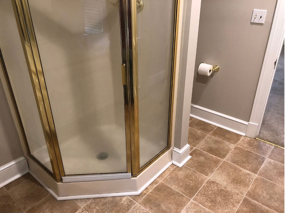
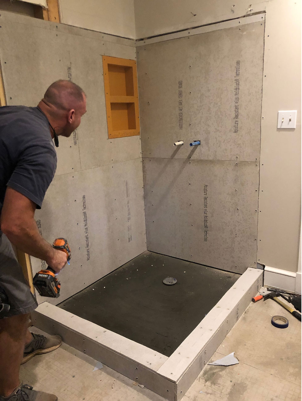
We flip-flopped the location of the shower and toilet to make the room feel bigger and installed a frameless glass shower enclosure to make this change work well.
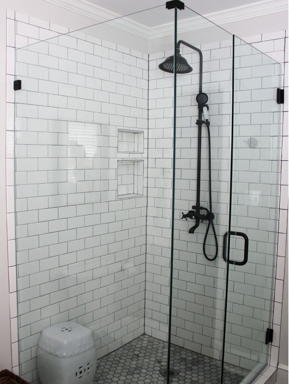
We chose a large 12 x 24 slate tile for the bathroom floor, white subway tile with gray grout for the shower walls, and a beautiful marble hexagon tile for the shower floor. All of these tiles are in the same family and work well together, especially with the antique black faucets and hardware.
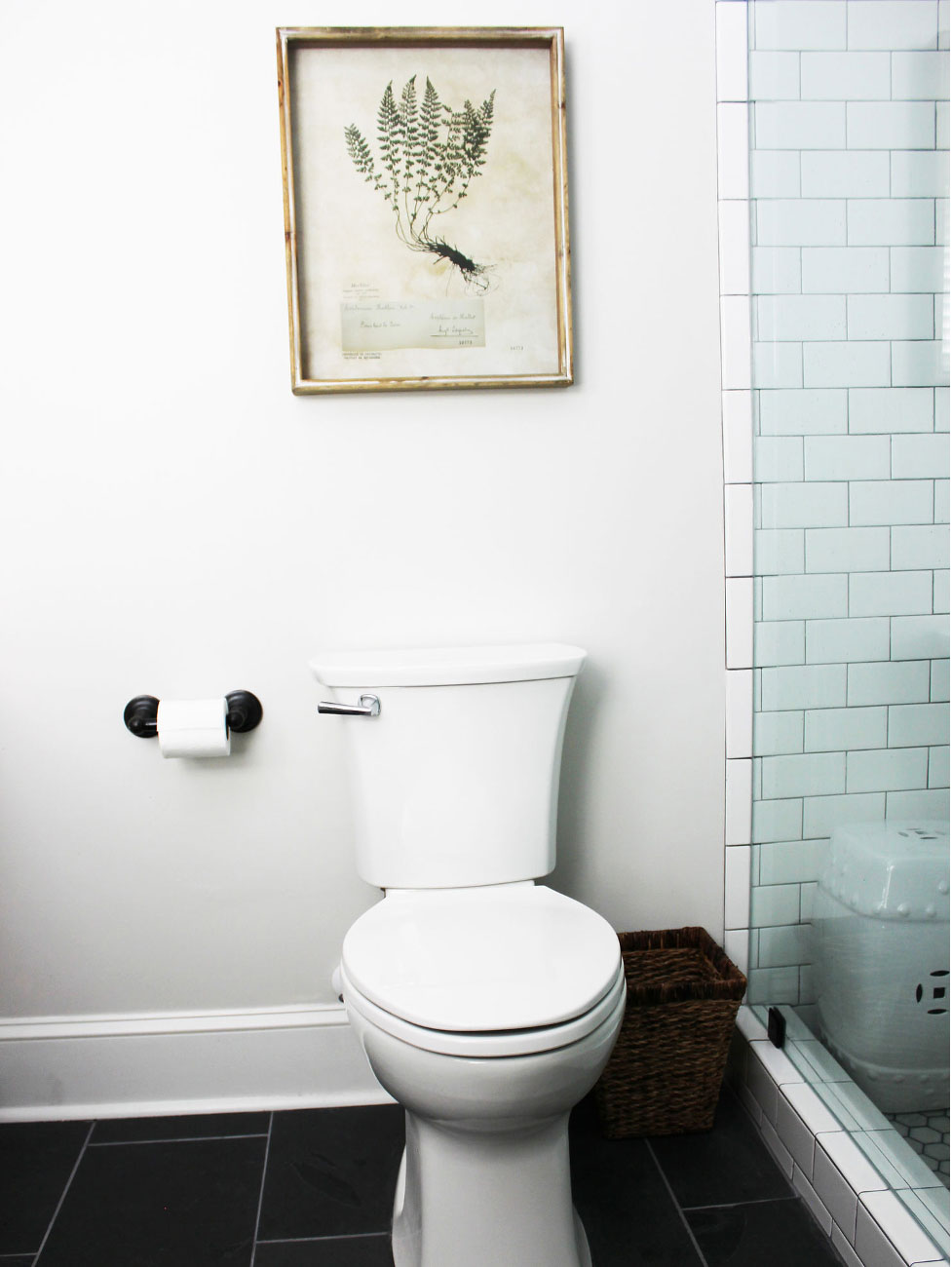
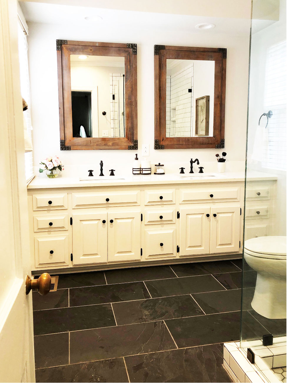
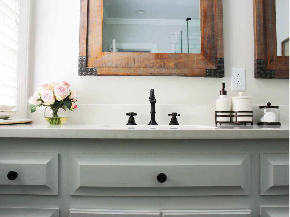
To finish off the space we touched up the paint on the vanity and added new hardware. We then replaced the countertop with quartz and installed pretty antique black faucets. And last but not least, we hung large reclaimed wood mirrors over each sink. These finishes created both a classic and fresh look with a rustic touch.
Guest Bathrooms
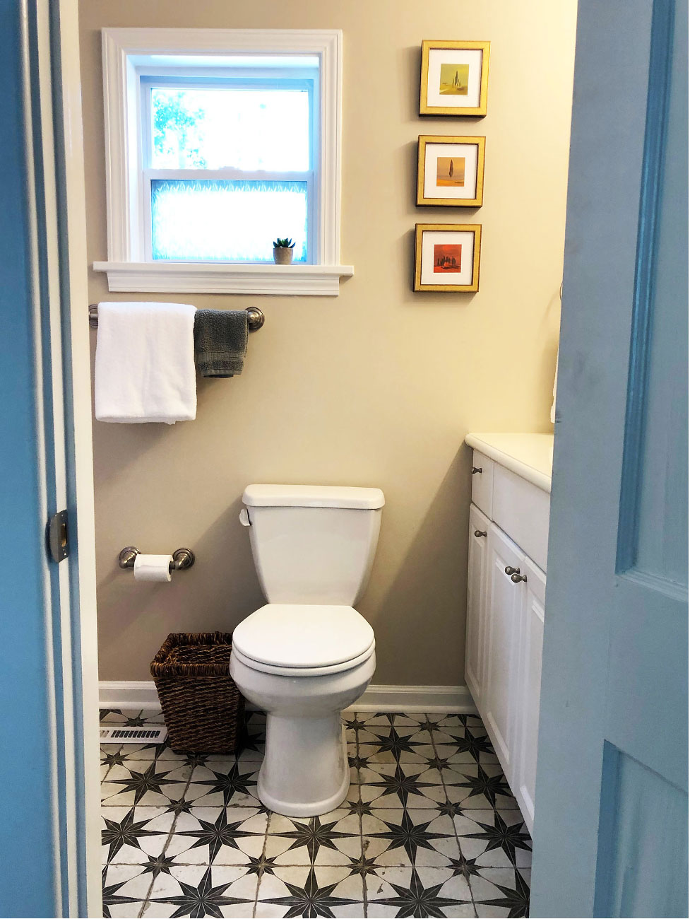
Next we turned to the two guest bathrooms. The smaller of the two received simple updates: we removed the glass shower door making way for a shower curtain to soften the space and installed a new vintage inspired star tile on the floors. These small changes certainly made a big impact in such a small space.
The second guest bathroom ended up receiving a complete renovation after we were unable to repair the blue tile around the tub/shower walls once the shower doors were removed. So, we tore out everything except the vintage tub which received new glazing making it look like new.
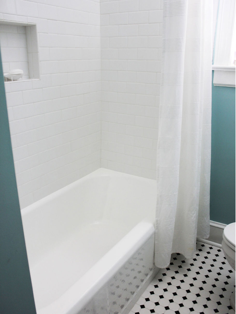
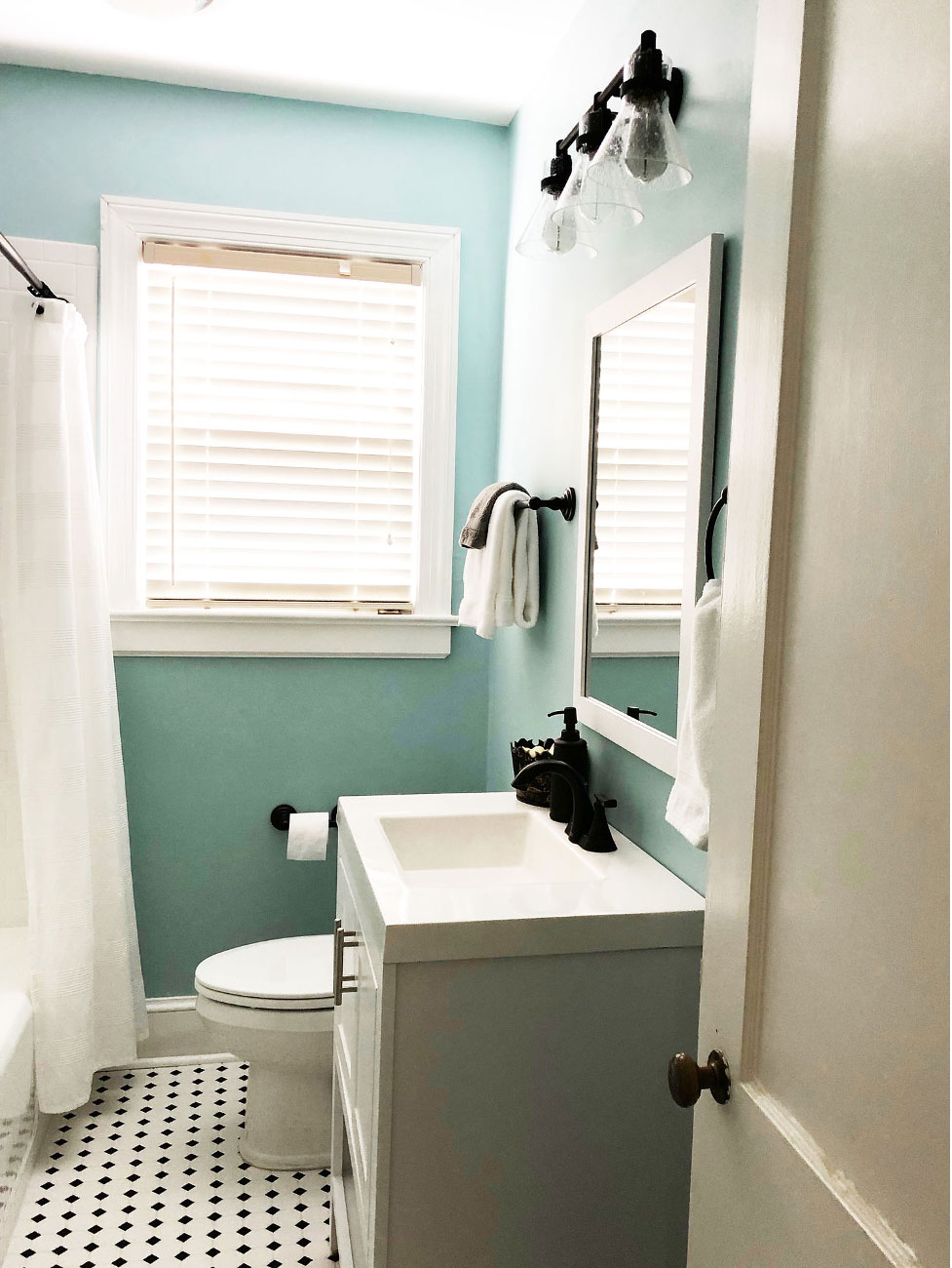
We then added a classic subway tile on the tub/shower walls and a vintage black and white floor tile. The new white vanity also allows for extra storage. We continued the them of dark fixtures and then painted the walls a cheerful shade of blue to welcome guests.
Final Touches
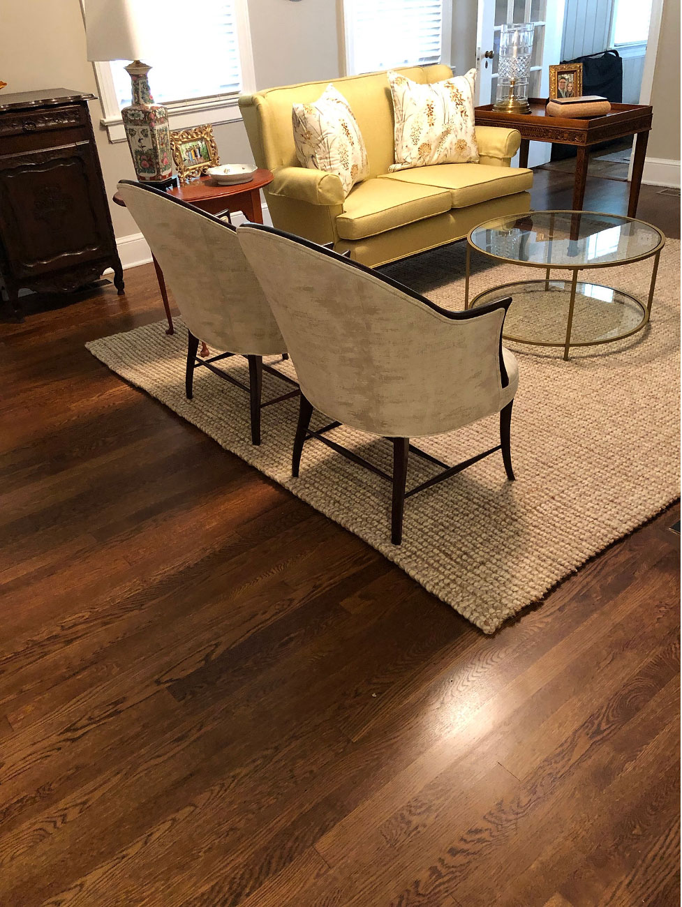
While no simple task, the carpet from the bathroom and office were removed and replaced with hardwood floors. We made sure the new floors matched the original floors. Our hardwood floor guys then came in and refinished all of the floors. Once stained plus three coats of polyurethane, they really shined. Did I mention the floors were refinished during our five-week timeline? Seriously.
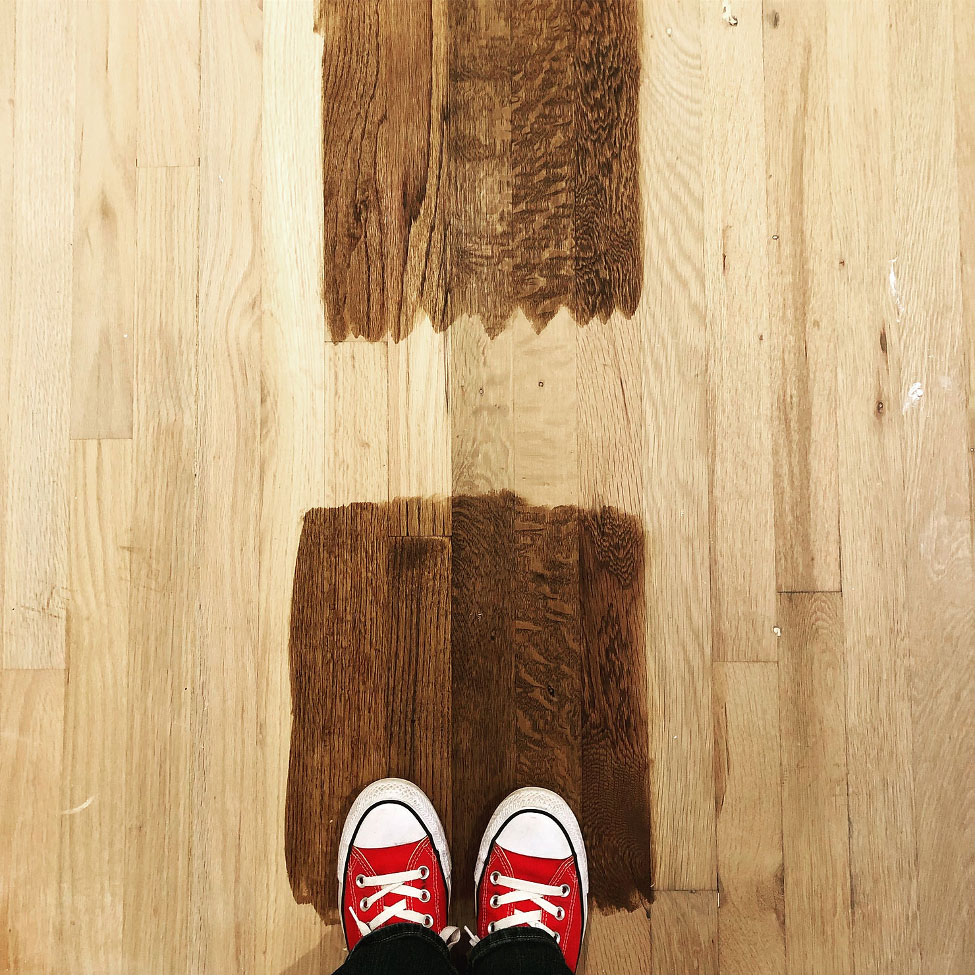
But just look how pretty they turned out. There’s nothing quite like beautiful hardwood floors.
We had a few other repairs and finishing touches throughout the house and are thrilled with the way this renovation turned out. We were able to make simple changes to a historic house and the result is a beautiful home. And now it’s ready to welcome our new homeowners.
+ Show / Hide Comments
Share to: