Painting the Trim and Walls the Same Color and Why I Love It
Recently I’ve grown to love painting the trim and walls the same color. It adds a rich and timeless look which works well in the historic homes I renovate.
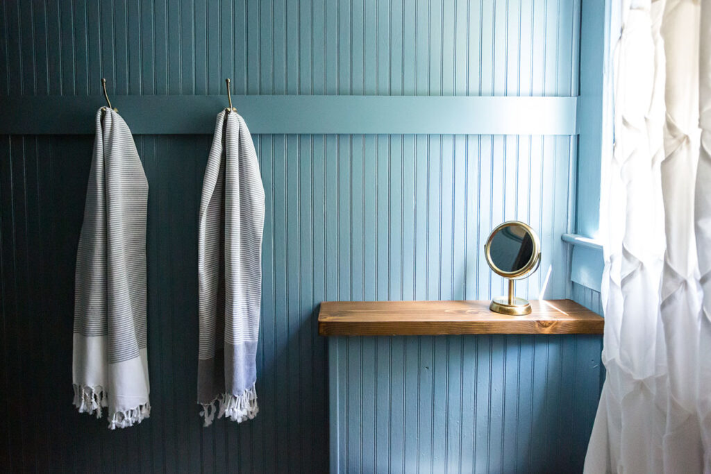
For years the norm has been to paint the walls one color and the trim a contrasting color, often a shade of white. While I like that approach and use it the most often, lately I’ve been leaning into painting everything the same color. And as it turns out, I’ve been doing it for a few years now.
The West End
Back in 2021 we were renovating the West End. As part of the bathroom renovation, we tore out a small brick column in the corner to give the small space a little more room. Before demolition began, we carefully removed the existing beadboard and reinstalled it adding trim pieces to cover the seams. To tie everything together, I decided to paint the trim and beadboard walls a pretty shade of blue.
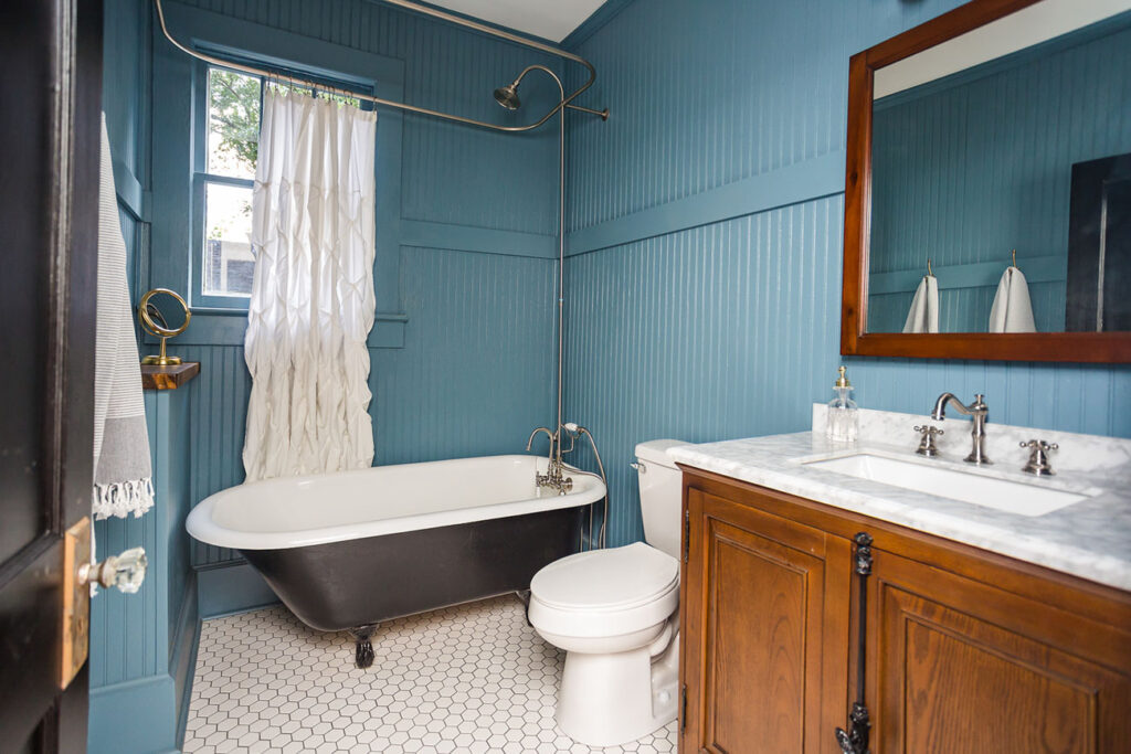
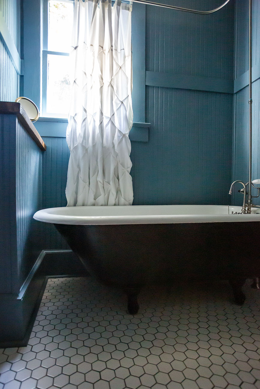
It resulted in a timeless look and a great backdrop to compliment the original clawfoot tub.
My 1914 Bungalow – The Mud Room
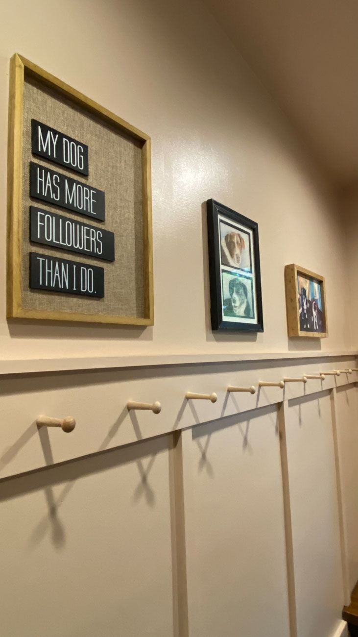
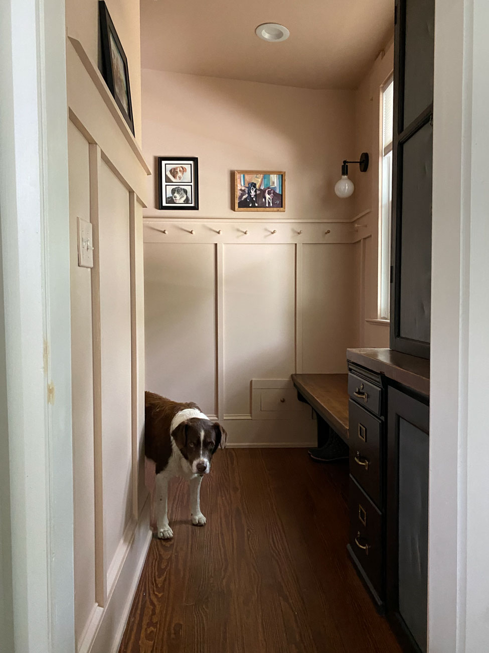
Last year I decided to transform the unused office nook in My 1914 Bungalow home to a mud room. You can read about all of the changes I made to this space here. After installing board and batten to the walls, I decided to paint everything – trim, walls, and in this case, the ceilings – a warm shade of dusty pink, Farrow and Ball Setting Plaster.

With sloped ceilings in this small space, the one color scheme made the room feel more pulled together.
The Powder Room at Martha’s Manor
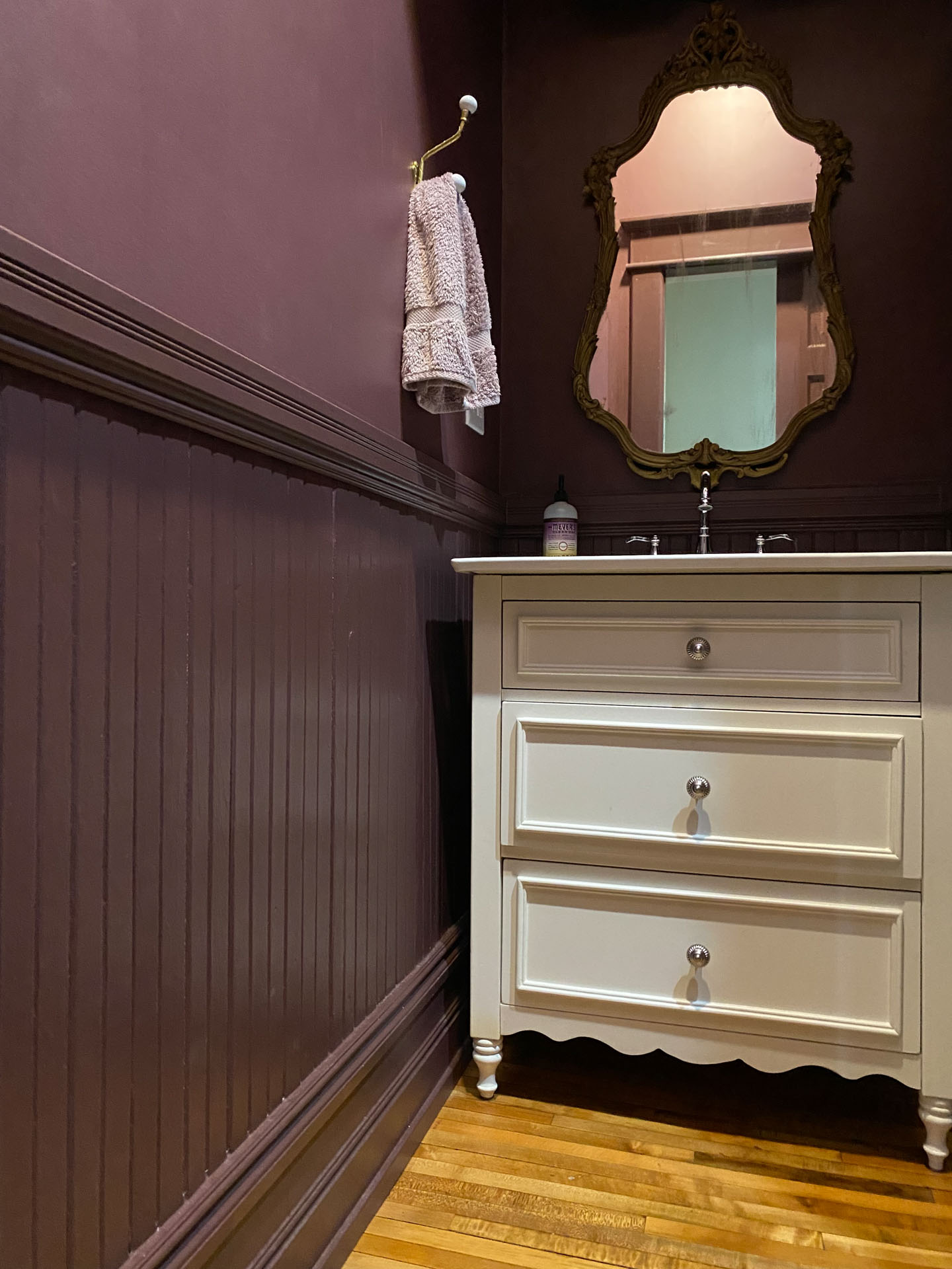
When my client told me she wanted to paint the powder room of Martha’s Manor a dark purple, I was all for it. Since that space is tiny and has several shapes and nooks, we decided to paint everything Sherwin Williams Carnelians. It’s a deep shade of purple that no only ties everything together but also is the perfect touch for this quirky and unique space.
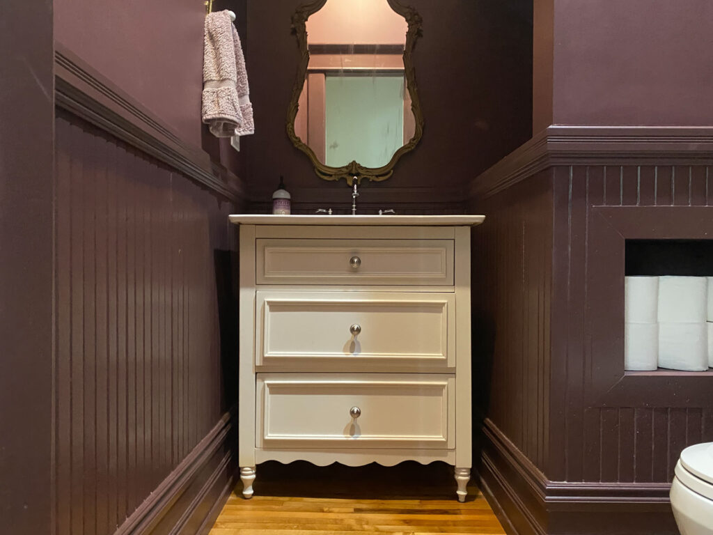
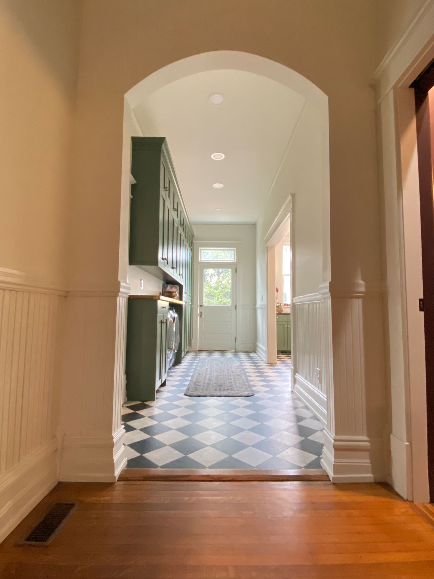
We also did the same in the hallway by painting the walls in flat and the beadboard and trim in Sherwin Williams Greek Villa.
The Corner Cottage
With those all one color projects under my belt, I decided to really lean into the concept for several rooms in the Corner Cottage.
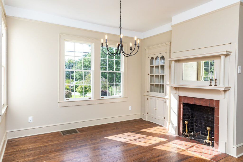
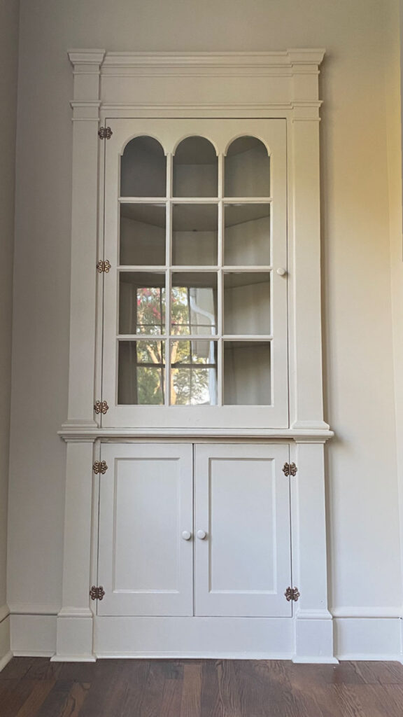
My favorite use of this design style is in the dining room where we painted everything my favorite beige, Valspar Oatbran. It’s a pretty neutral and made the corner hutch we relocated from the old kitchen, and the salvage mantel we added, feel as if they’ve been there all along.
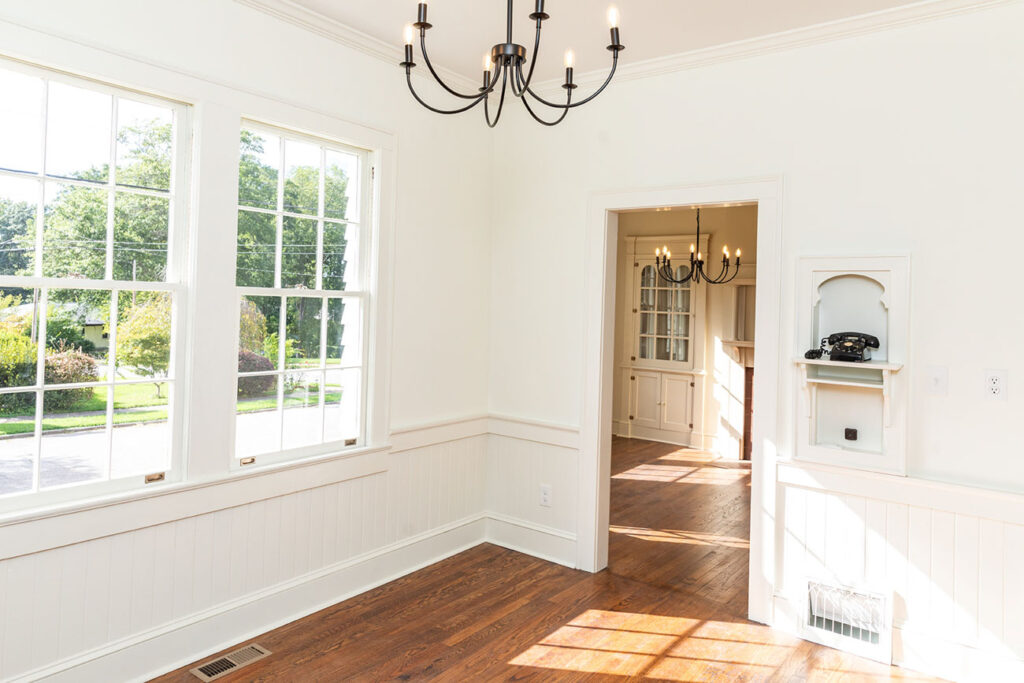
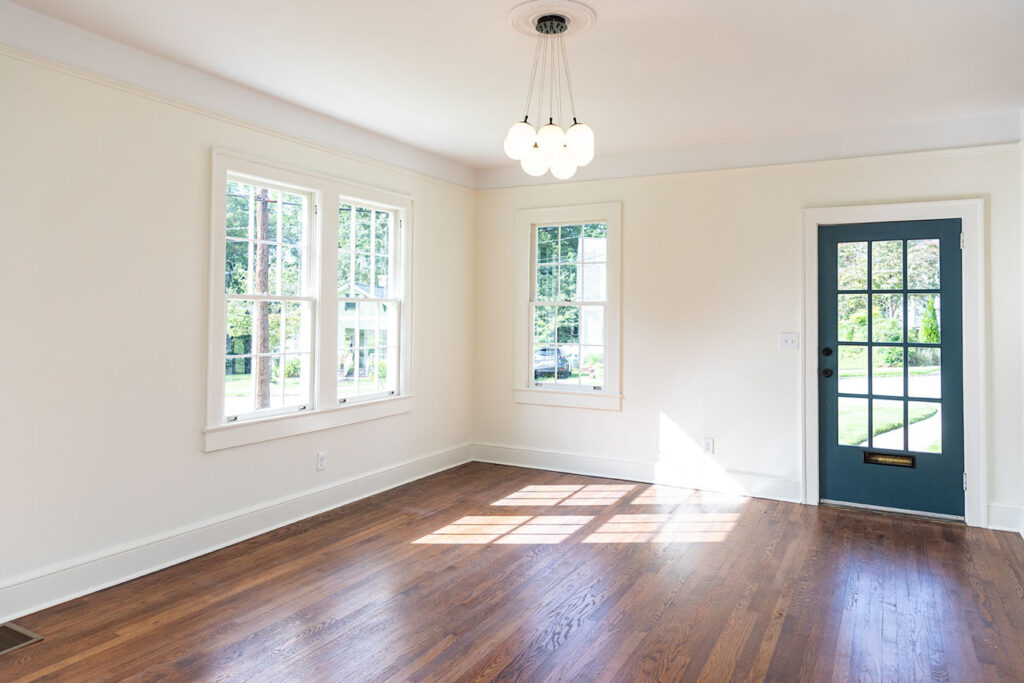
In the kitchen, breakfast nook, living room, and den, we kept things neutral as well. The walls and trim were painted Benjamin Moore White Dove which helps to keep these spaces feel bright with all of the natural sunlight coming in from the windows.
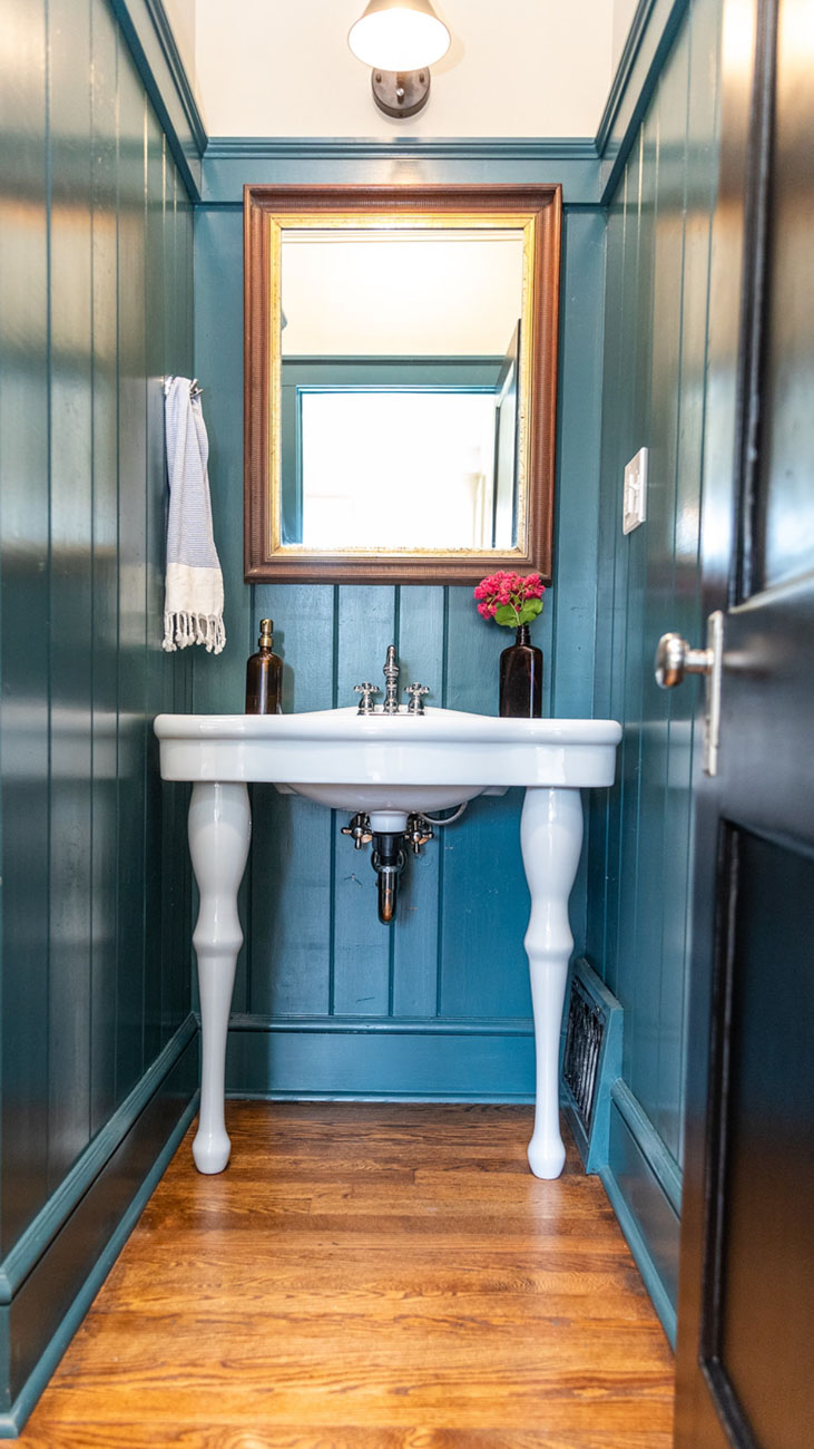
And last by not least, the new powder room paneling and trim is all painted a gorgeous blue-green in Sherwin Williams Still Water. While I decided to paint the wall above a different color, the concept is the same with the height of the wainscoting. This room is probably my favorite in the entire house.
One Piece of Advice
My advice if you’re on the fence as to whether or not to paint the trim and walls the same color is to go for it. After all, it’s only paint so easy to change. I think it adds warmth to any space and a vintage feel to a room.
My only piece of advice is to be careful on mixing the sheens of the paint with dark colors. Recently I found that lesson out the hard way. We are painting two offices a dark green and the semi-gloss on the trim and wainscoting looked a different color than the flat walls. The solution was simply to paint everything in an eggshell finish and that did the job.


We recently added beadboard to our half bath off of our kitchen after removing wallpaper. I painted the wall the same color as the kitchen and painted the beadboard and trim white. I do like the look of it, however I’m not sure it goes with the kitchen now. The wallpaper went nicely, but we had to remove it. If I did paint the beadboard the same color what would I do about the trim around the white door? I was also considering painting the ceiling the same color, or would that be too much? The wall color is a nice medium sage green.