Mills Avenue Kitchen Renovation
Our Mills Avenue kitchen renovation made the most used room in the house finally feel like it belonged.
The Before
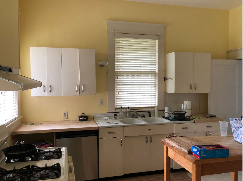
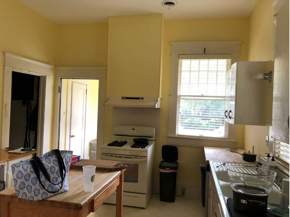
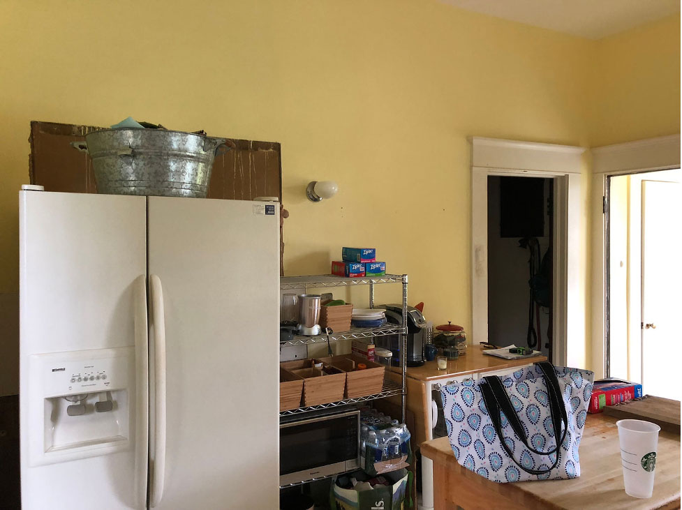
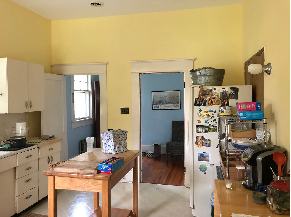
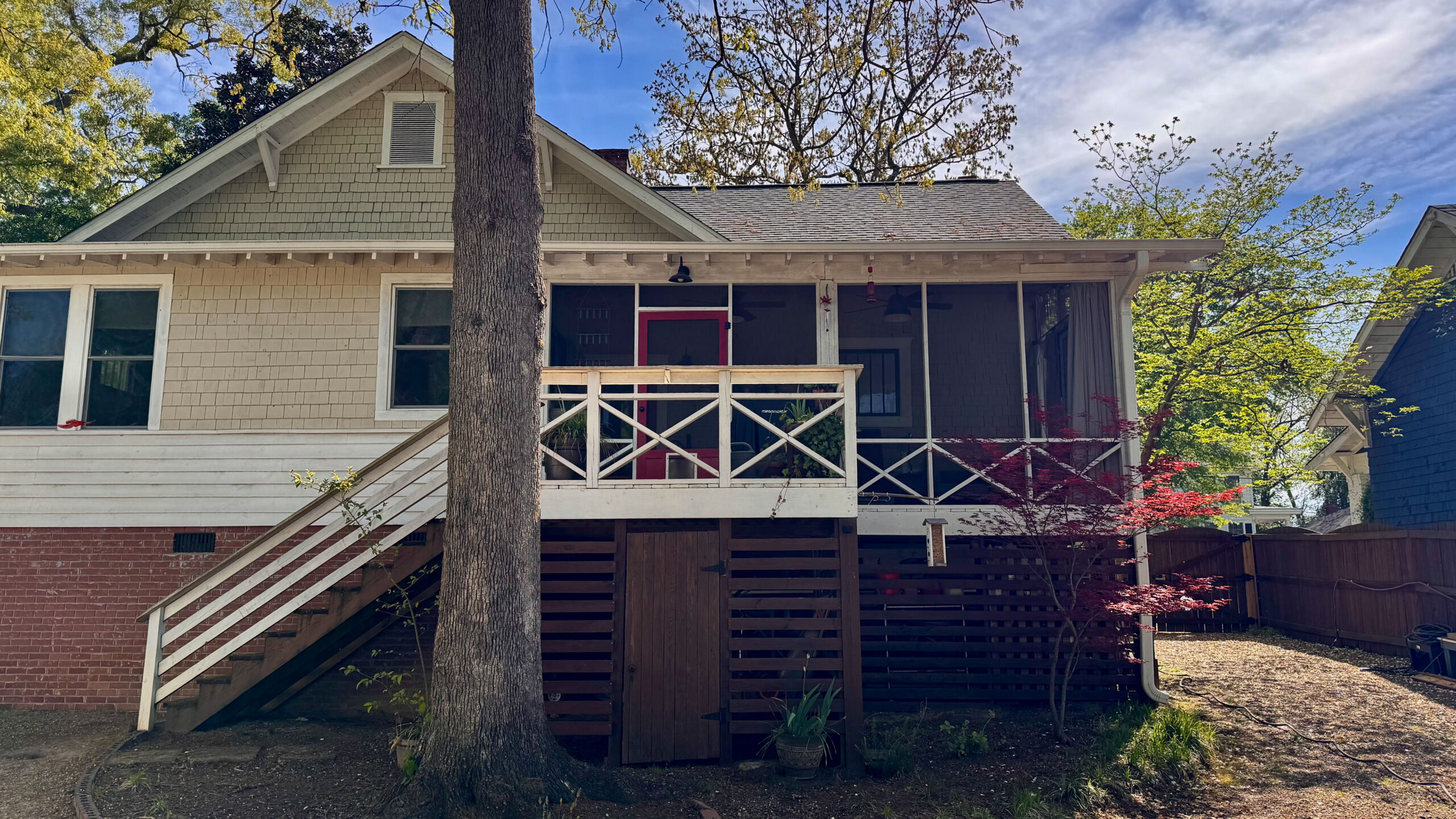
My clients have a beautiful Craftsman bungalow with original stained wood throughout much of the house but when you walk into the kitchen you saw this.
The Design Plan
While attempts had been made at some point over the years to update the kitchen, the lay-out did not work well and the space seemed small. So, when I first met with my clients we had a chance to talk about how they would like to use the space. We discussed what changes they’d like to see and what the must haves were for this kitchen renovation.
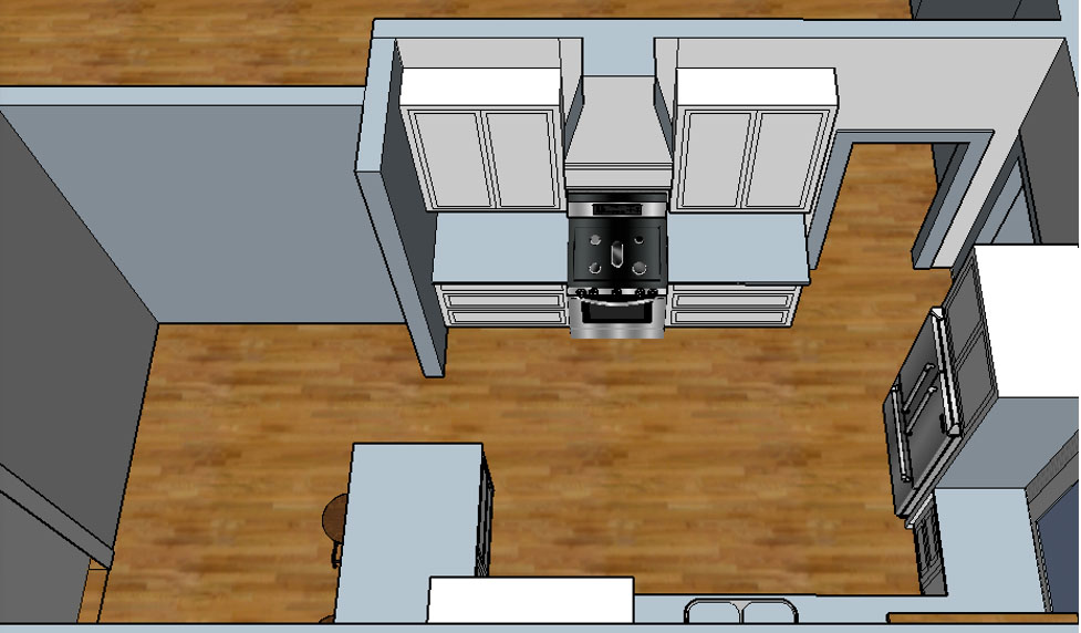
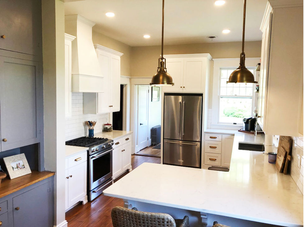
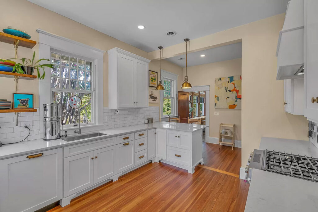
After several lay-out revisions we landed on this final design which allowed for lots of storage and a great flow for entertaining with bar seating. We worked the design plan around the original windows that let in tons of natural sunlight by adding custom wood shelves rather than upper cabinets on that wall.
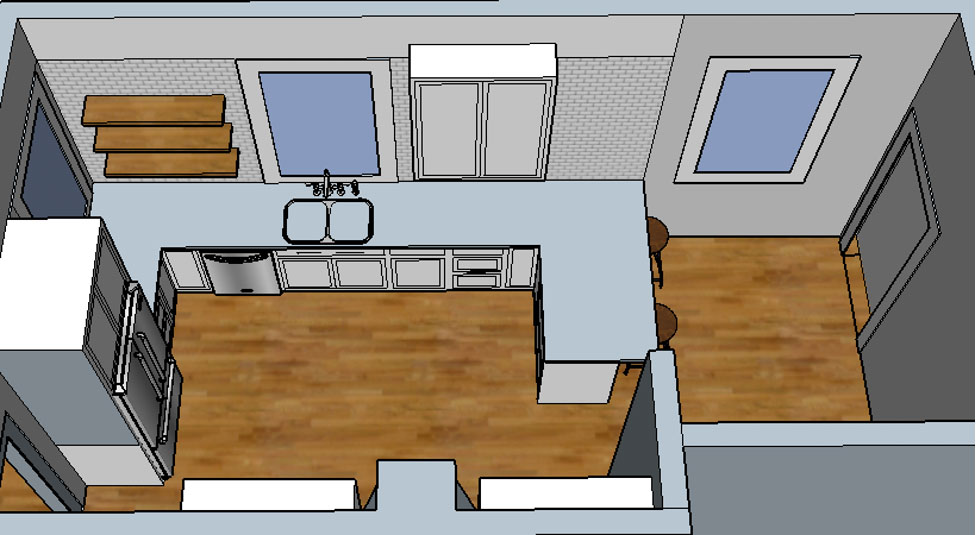
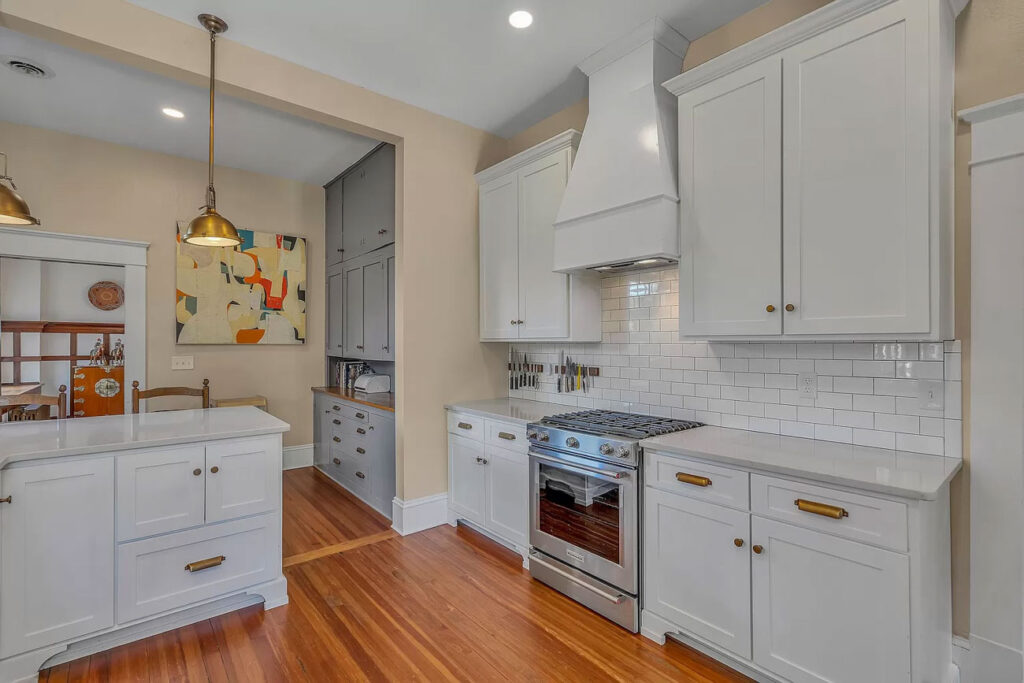
By switching the stove and refrigerator, we were able to achieve a more balanced look and at the same time plenty of countertop for cooking. We also opted for open shelving to the left of the kitchen window and upper cabinetry on the right side for everyday dishes and cups.
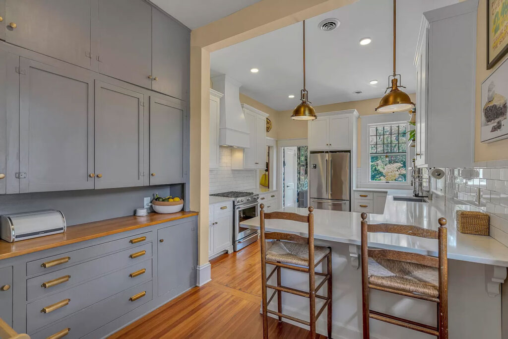
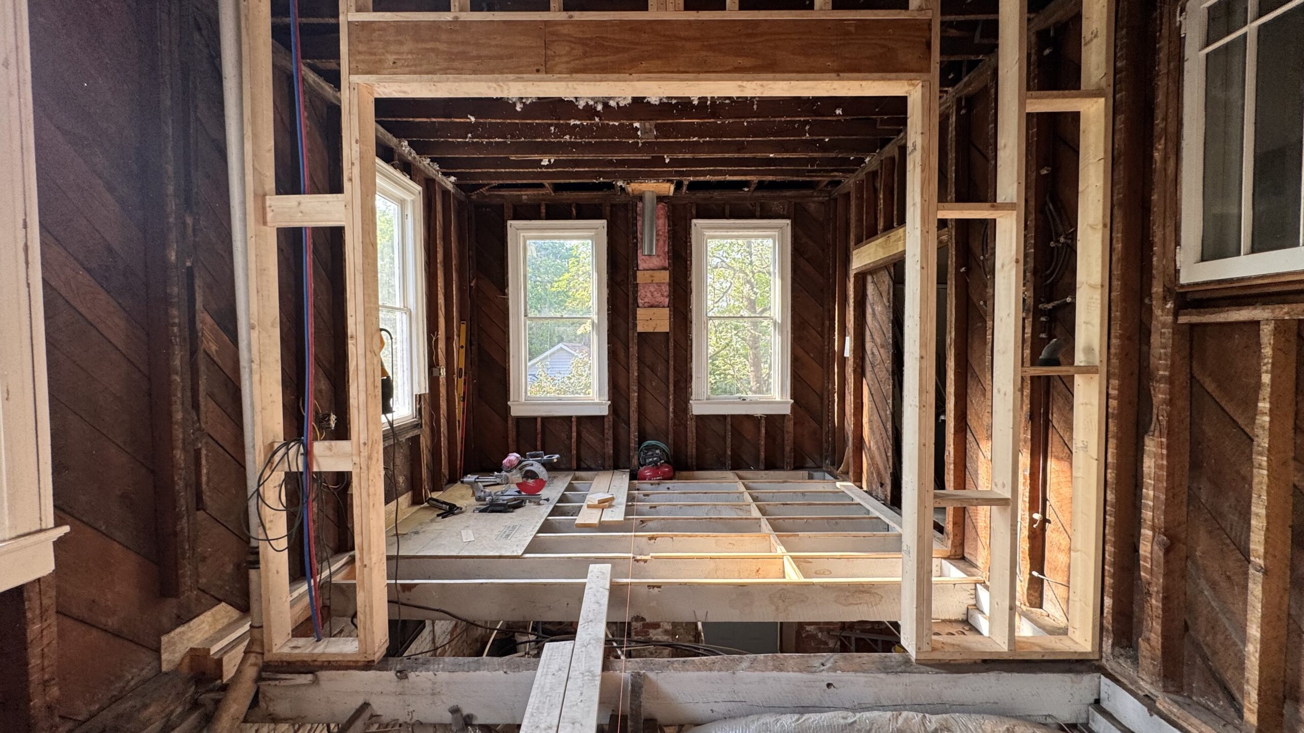
In order to bring this One Room Design Plan to life we started with the biggest change at the top of the ‘must’ list – removing the wall between the kitchen and butler’s pantry. By removing the wall, both spaces instantly felt bigger.
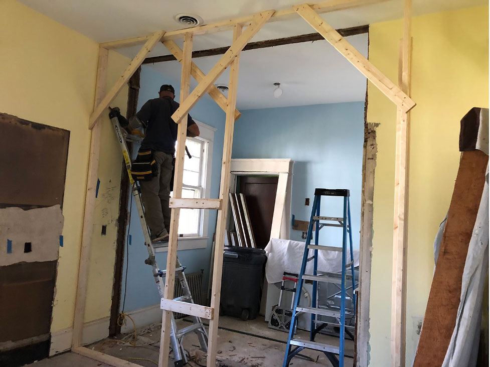
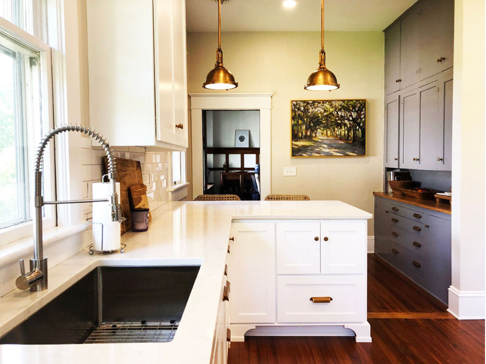
While we did have to install a header for structural support, the rest of the wall was removed. This made way for bar seating and shows off the original cabinets in the Butler’s pantry. My clients did a great job of refinishing them and then painted in a rich shade of gray with hardware to match the new kitchen cabinetry.
The After
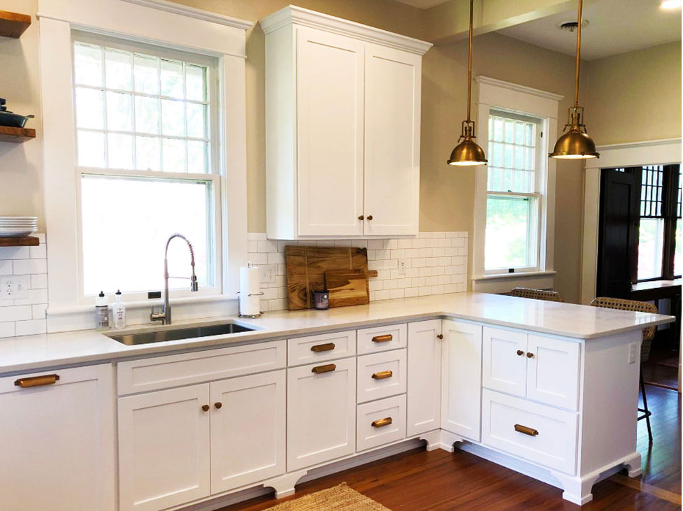
The custom wood cabinets have Shaker style doors and drawers painted bright white with decorative toe kicks along the bottoms for a more custom look.
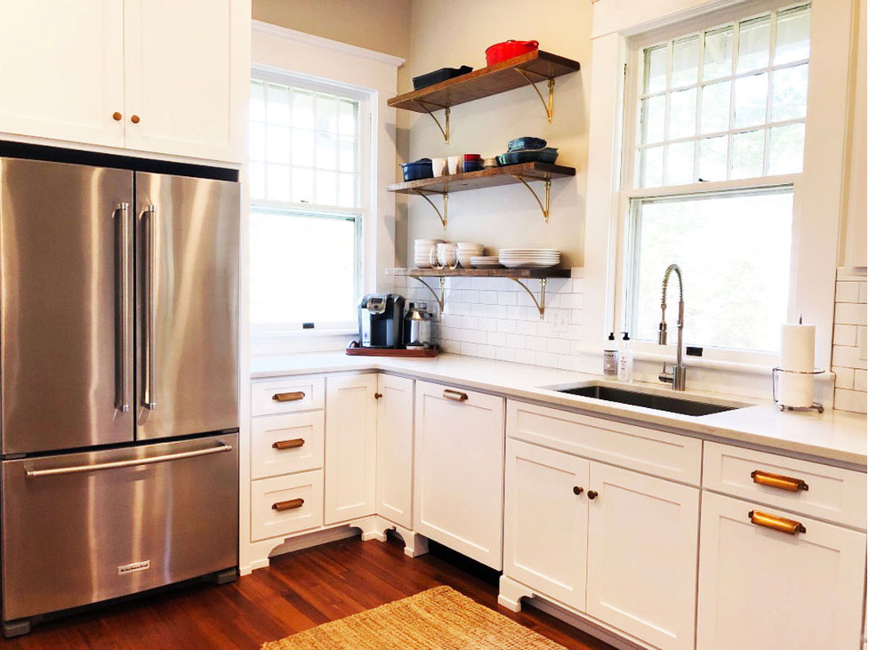
If there is any piece of advice I can give you it is this: have your kitchen cabinets custom made by a local cabinet shop. It’s worth every penny and because nothing in an old house is ever plumb, level, or square, their expertise in getting everything just right is the best decision you’ll make.
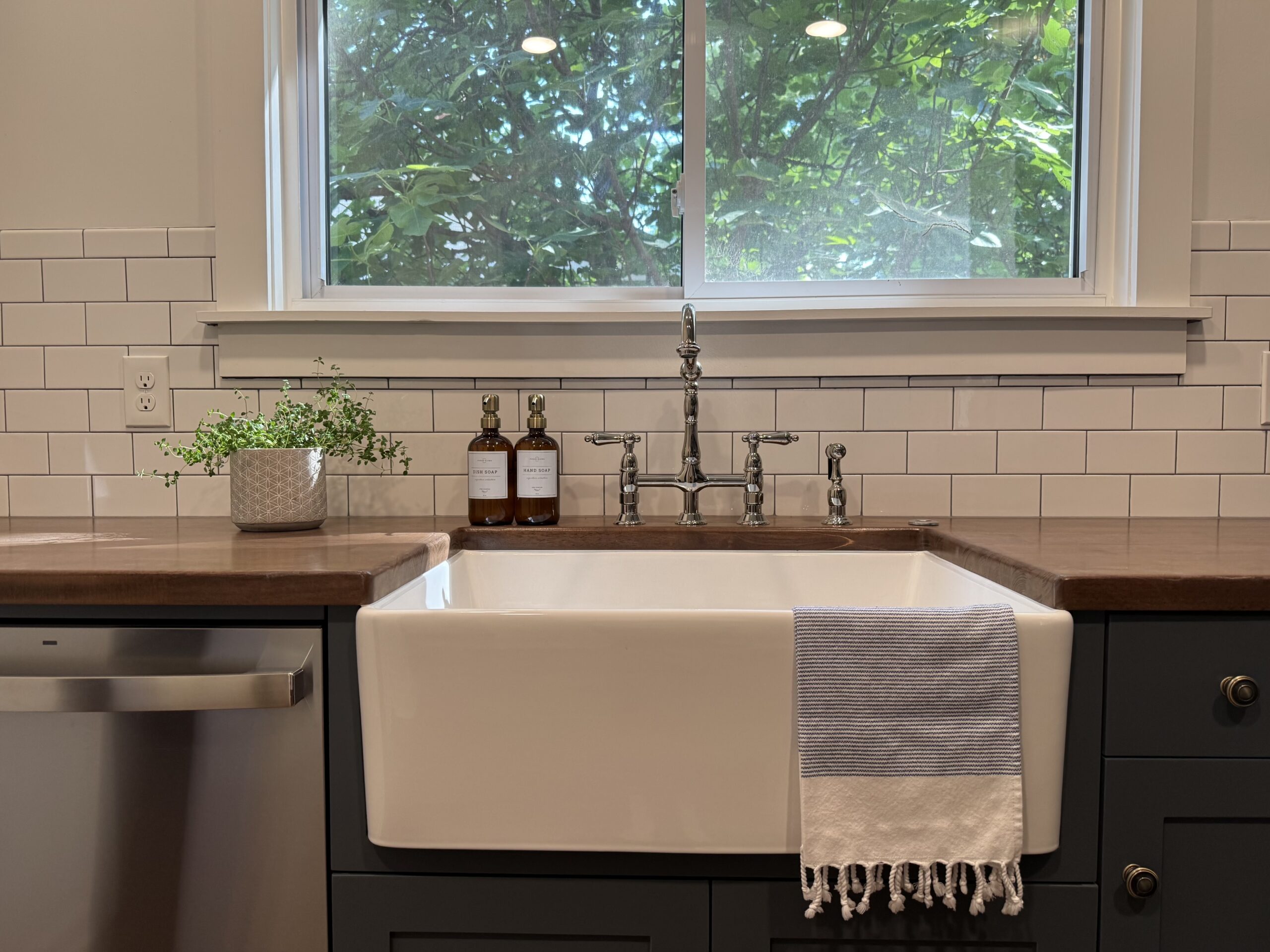
To complete the look we painted the walls a light tan and added antiqued brass hardware and pendant lights. The countertops are quartz with a white Subway tile backsplash with gray grout. We absolutely love the richness and timeless look of this kitchen and hope they will love it for years to come!
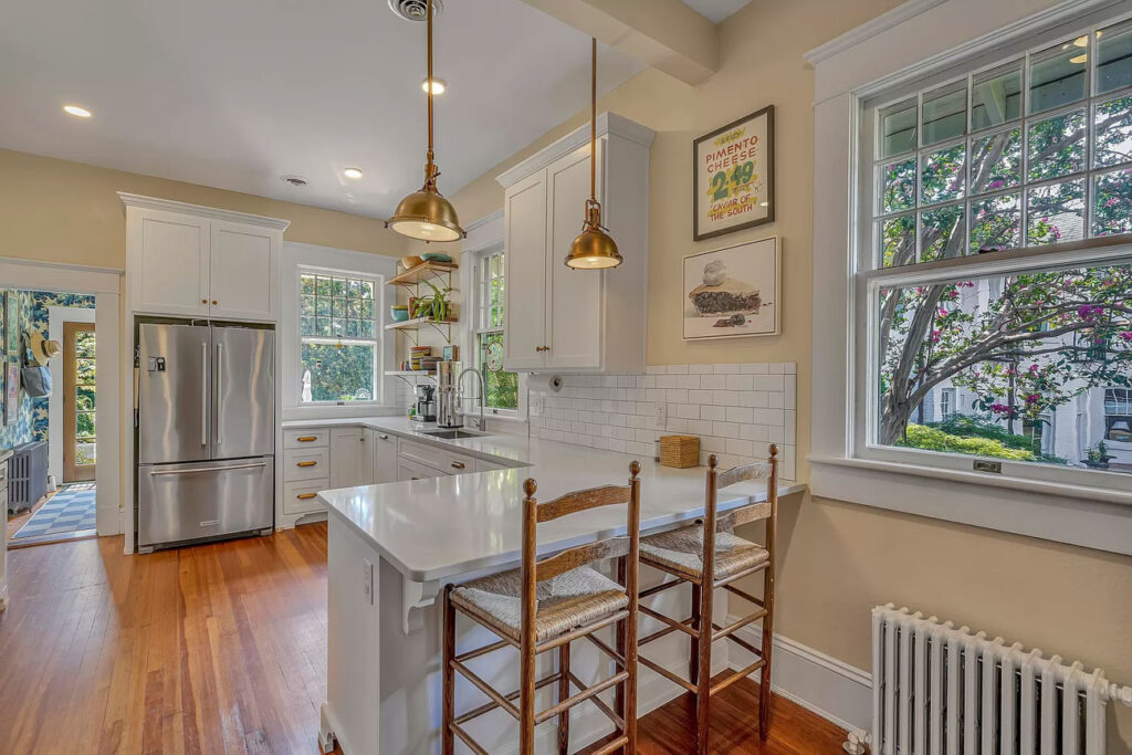
Update: This home has sold twice since we renovated the kitchen and as you can see from the listing photos from 2023, not much has changed. Perhaps that is the best compliment there is.
+ Show / Hide Comments
Share to: