Banda Bungalow: Interior Redesigned Floor Plan


So what’s one to do with just 1,188 square feet? While your first thought might be that a house that size is just way too small, you’d be surprised at how much you can work into the interior with the right floor plan. I’m a firm believer in using every available square inch in these old houses and that’s just what we did with the Banda Bungalow.
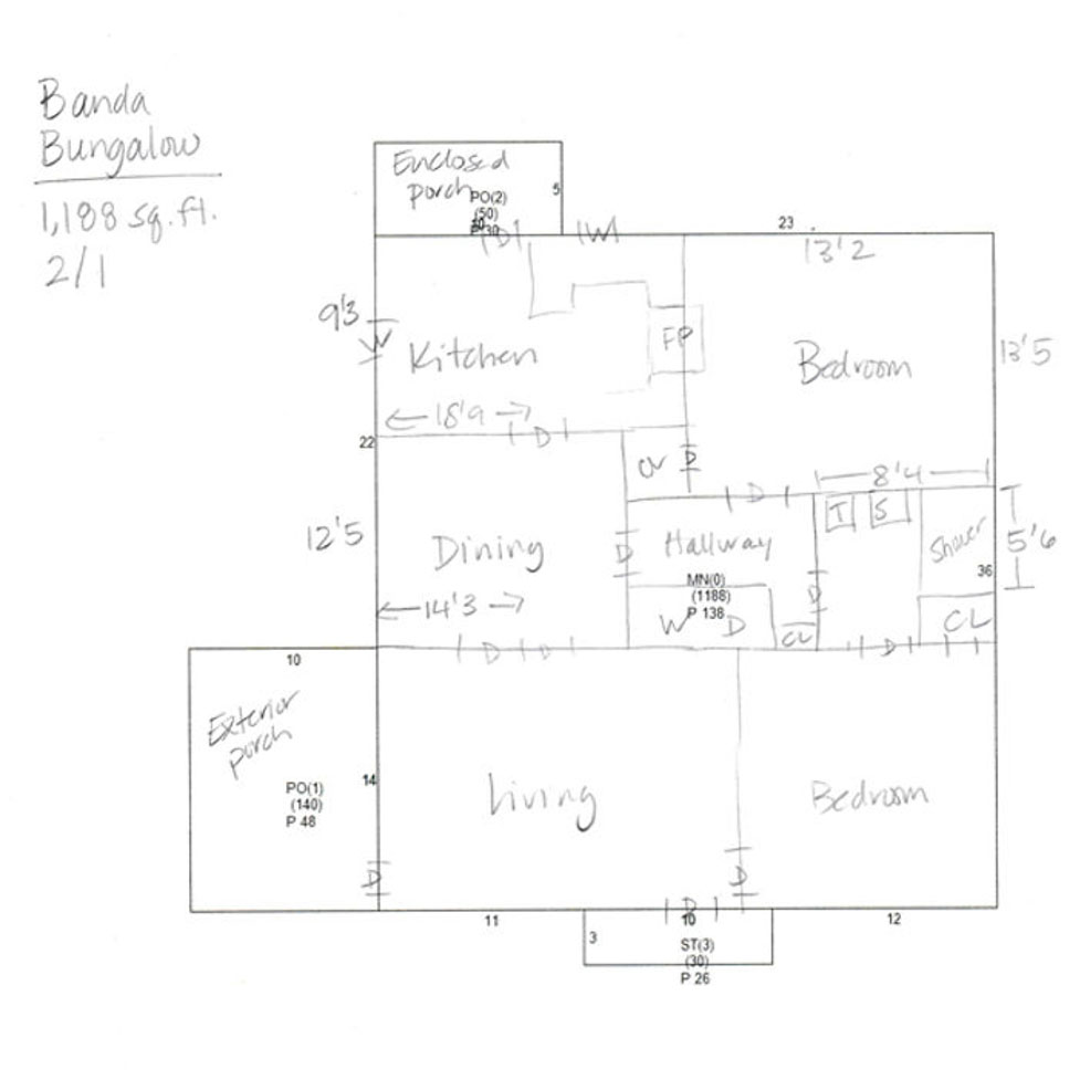
To start let’s take a look at the original lay-out. Spartanburg County provides downloadable sketches of houses drawn relatively to scale so here’s where I typically begin. It’s just the exterior of the house but with a few quick measurements, I can sketch out the interior floor plan.
After meeting with my client several times, here are the items we knew needed modifications:
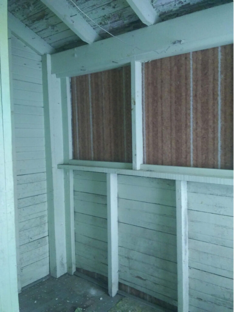
- The middle hallway area that housed the washer and dryer closet and led to the only bathroom in the house was wasted space.
- The kitchen needed to be redesigned to create a galley kitchen and my client wanted as large of an opening as possible between the kitchen and the dining room.
- The back enclosed porch was a possible option for relocating the washer/dryer.
- The back bedroom had an awkward corner closet and a larger closet that could possibly be used in a better way.
- After much back-and-forth, my client made the smart decision to go ahead and add a second full bathroom within the same square footage.
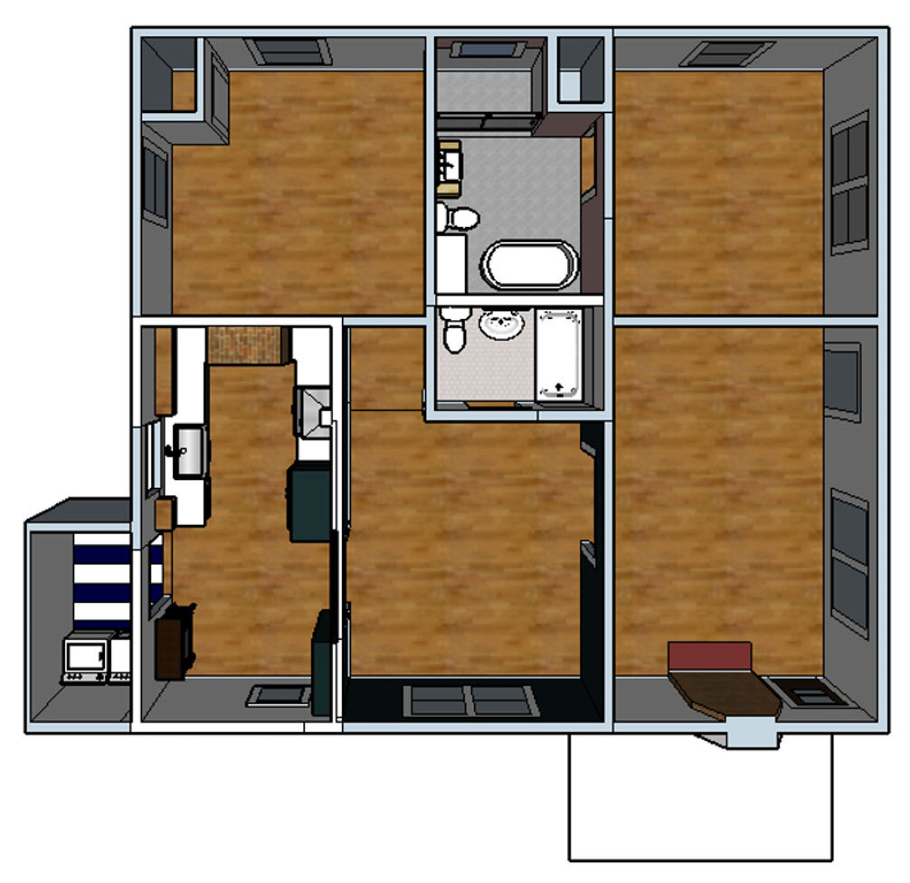
So from there I got to work on the new Redesigned Floor Plan to figure out the new lay-out. And here’s what we were able to come up with after many edits to the redesigned floor plan.
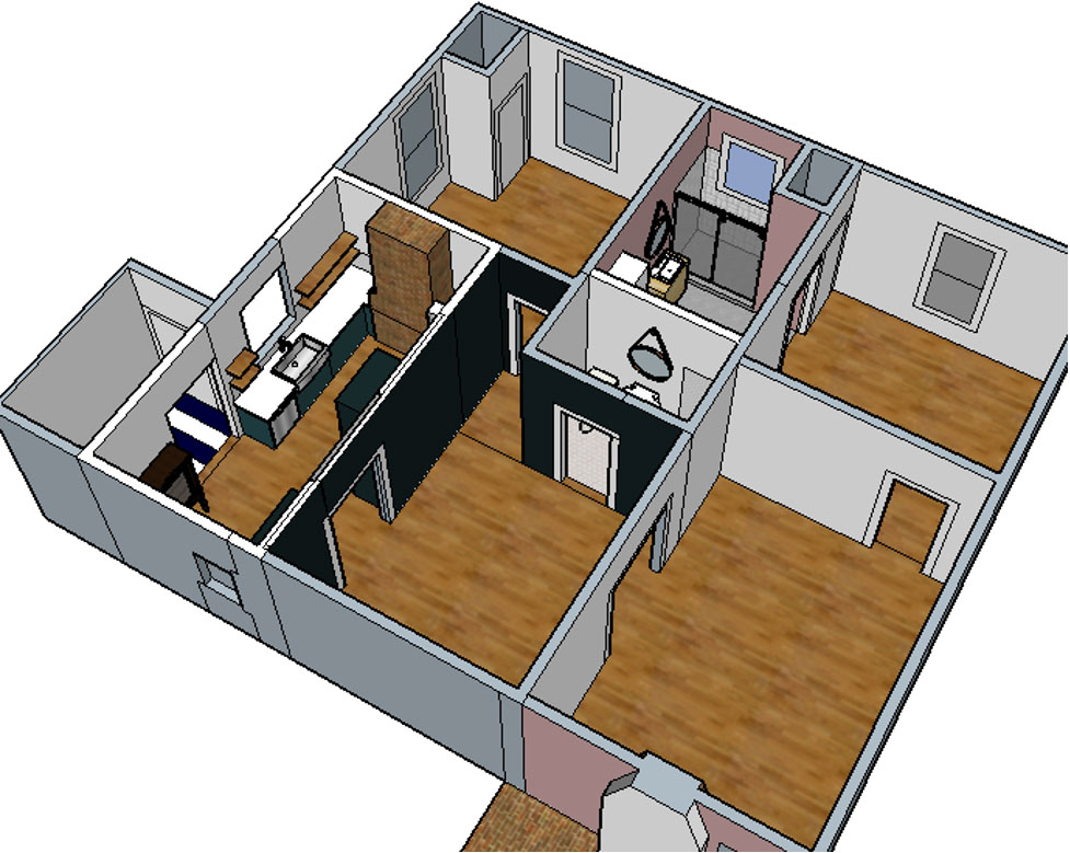
Today we’ll be walking through the changes to the ‘entertaining’ side of the house. Next week we will cover the bedrooms and bathrooms to wrap up.
The Interior Changes
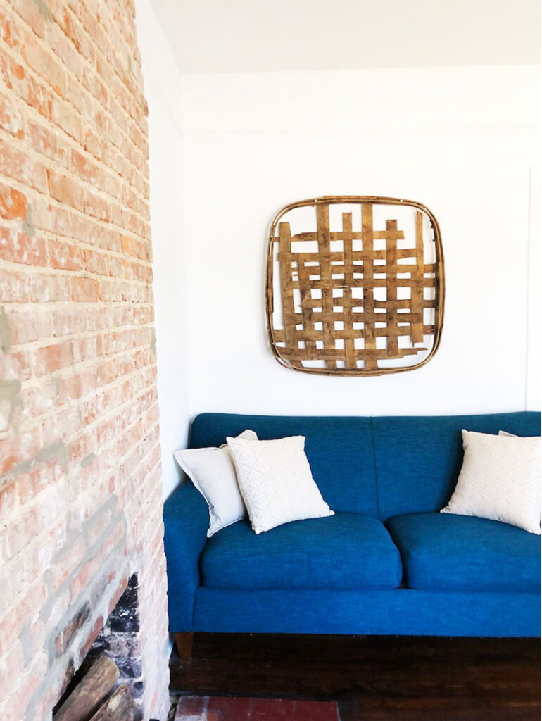
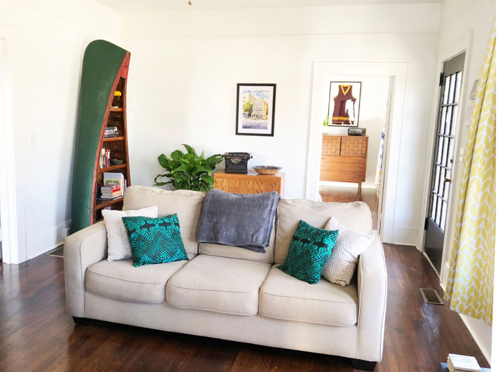
Living Room
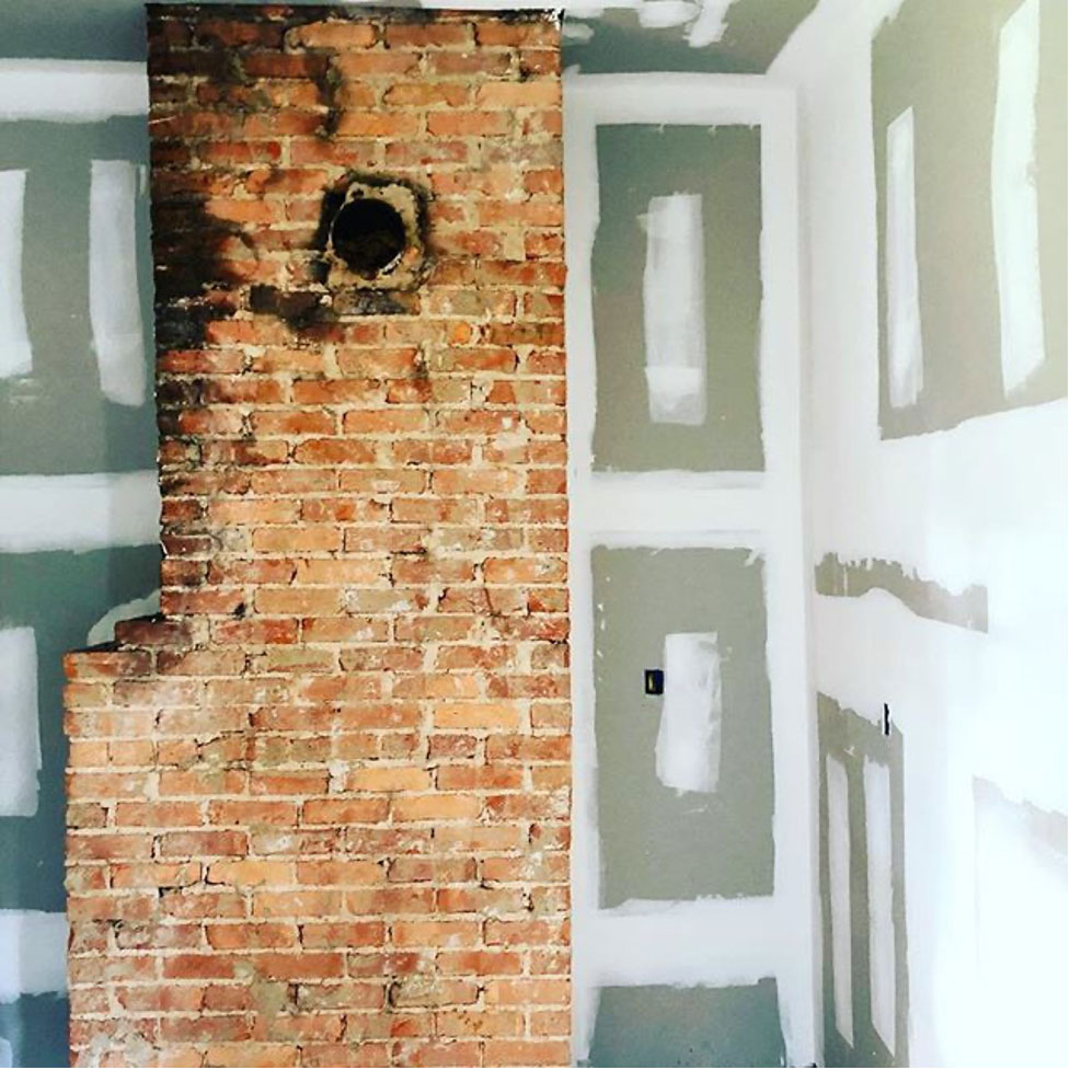
The floor plan of the living room remained the same but the overall space got a much needed facelift. We removed the cabinets to the right of the fireplace and removed the mantel and plaster to expose the brick fireplace. Keep your eye on that dangling chandelier….it’ll show up in the Dining Room where it’s meant to be.
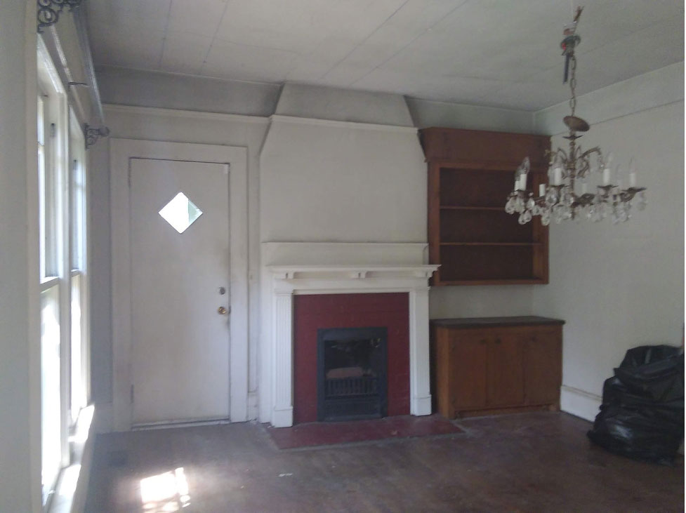
My client was really hoping to have exposed brick wherever possible even if it wasn’t 100% perfect. Luckily it was in pretty good shape overall and looks great with her vintage style.
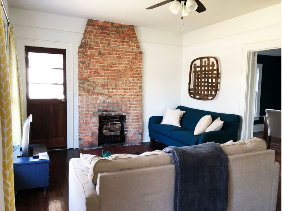
A bright coat of white paint on the walls and trim provides a great backdrop for her cool pieces.
TIP: I always get asked what shade of white I use and the answer is simple. 95% of the time my answer is the on-the-shelf bright white you can find at any home improvement or paint store. I use it on both the walls and the trim and have always found that to be the easiest option.
Since the exterior doors were not original to the house we were able to change those out. My client found some antique doors in Nashville and made the trip to pick them up. The front is a french door painted black and the side porch door has a large upper window. Both allow plenty of sunlight throughout the day.
Dining Room
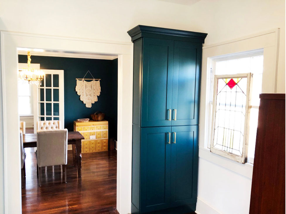
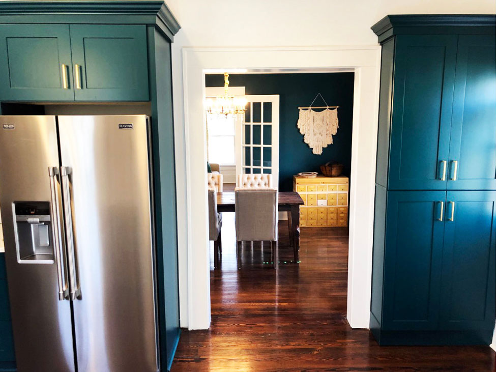
The dining room also did not change in terms of it’s original floor plan. However, we did make two modifications to adjoining spaces. The first came in the way of enlarging the opening from the dining room to the kitchen. Right from the beginning we knew the kitchen needed to be redesigned completely. So, we moved the enlarged doorway down a little so that we had more wall space for the kitchen.
Original doorway from the dining room leading to kitchen.
We moved it down slightly and enlarged it as well.
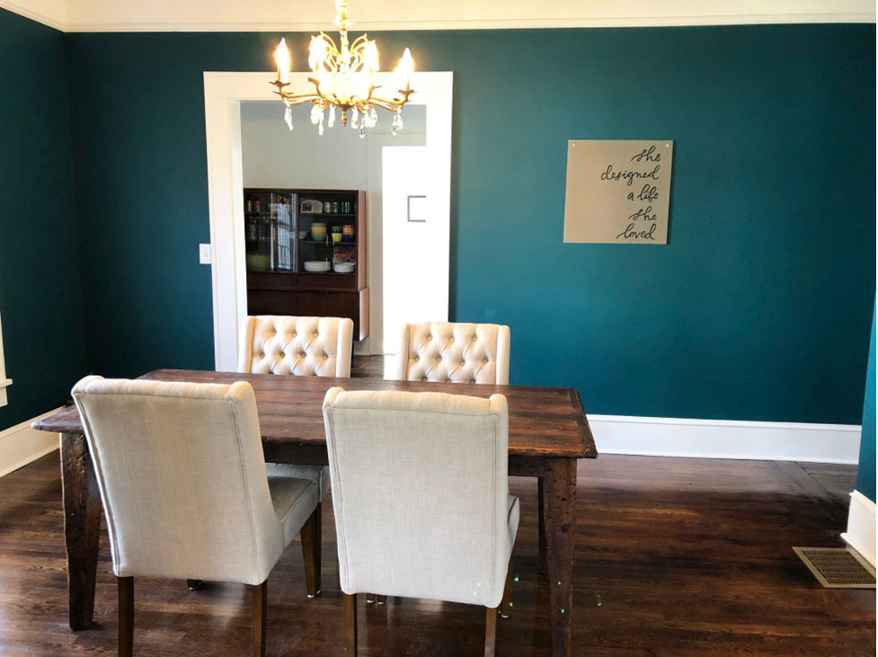
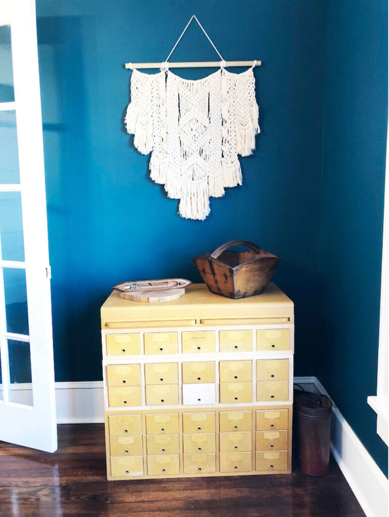
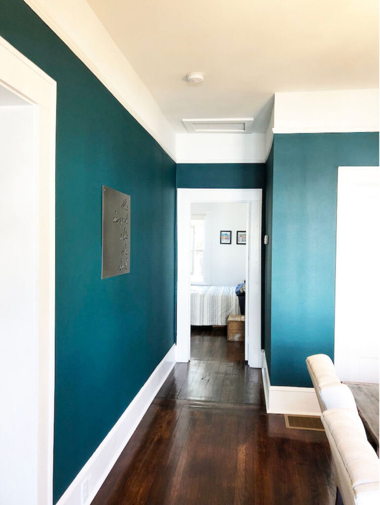
We painted the walls this beautiful shade of Sherwin Williams Blue Peacock. The dark blue green looks gorgeous with the original floors that we refinished and stained Honey.
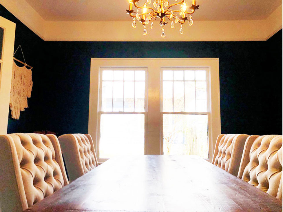
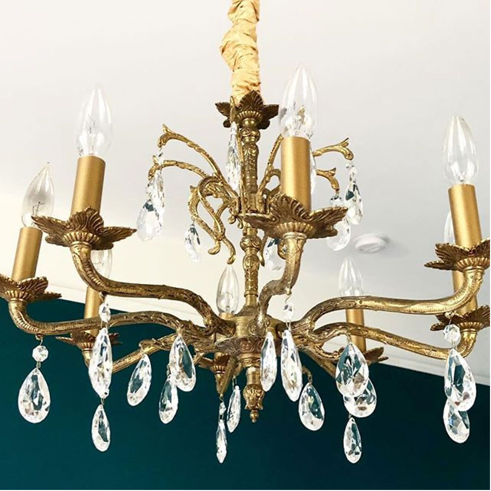
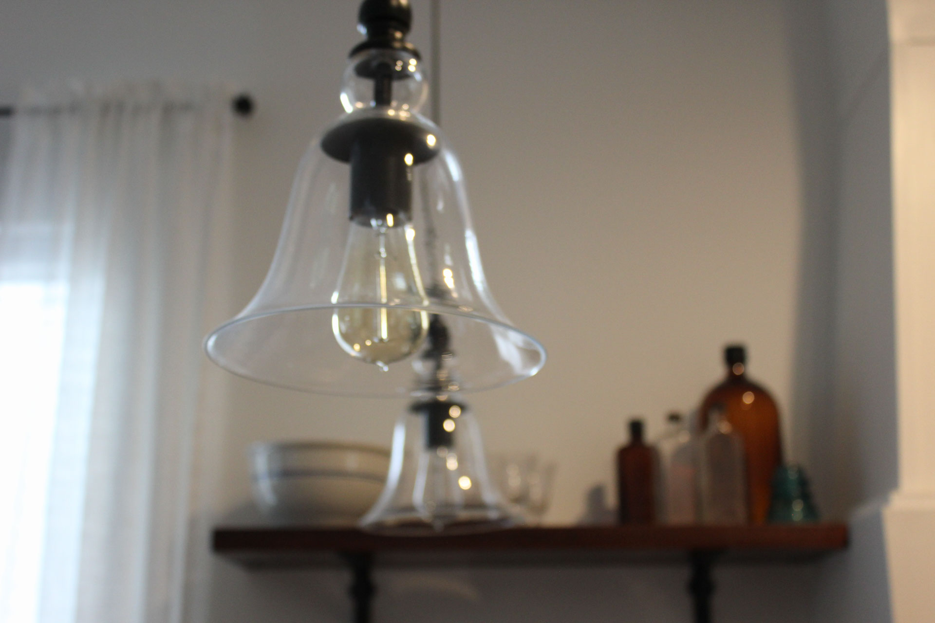
I was especially excited to be able to salvage this antique chandelier. Previously it was hanging literally by a thread in the living room. I was able to clean everything off, touch up with brass colored spray paint, and added a gold ribbon to cover the cords. I seriously love how it turned out and love that my client loves it even more.
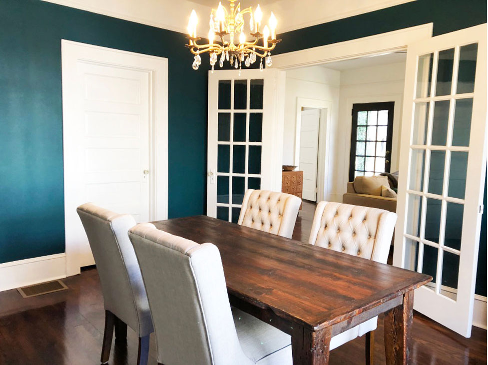
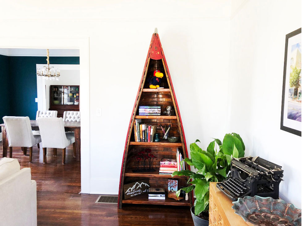
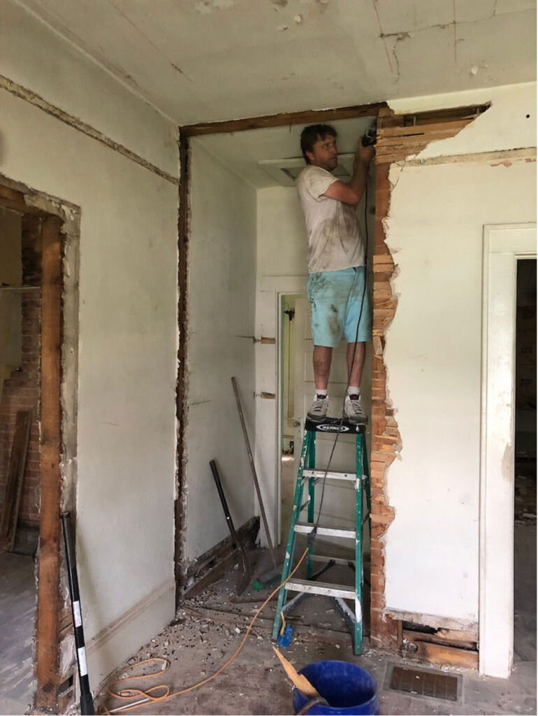
The second modification was to the left corner of the dining room facing the guest bathroom wall. Because of the way we redesigned the bathrooms and bedrooms, we needed a new entryway into the back bedroom. We created a new doorway into the bedroom and removed the small wall connected to the dining room. With this simple change, the dining room looks bigger and it feels like it’s original to the house.
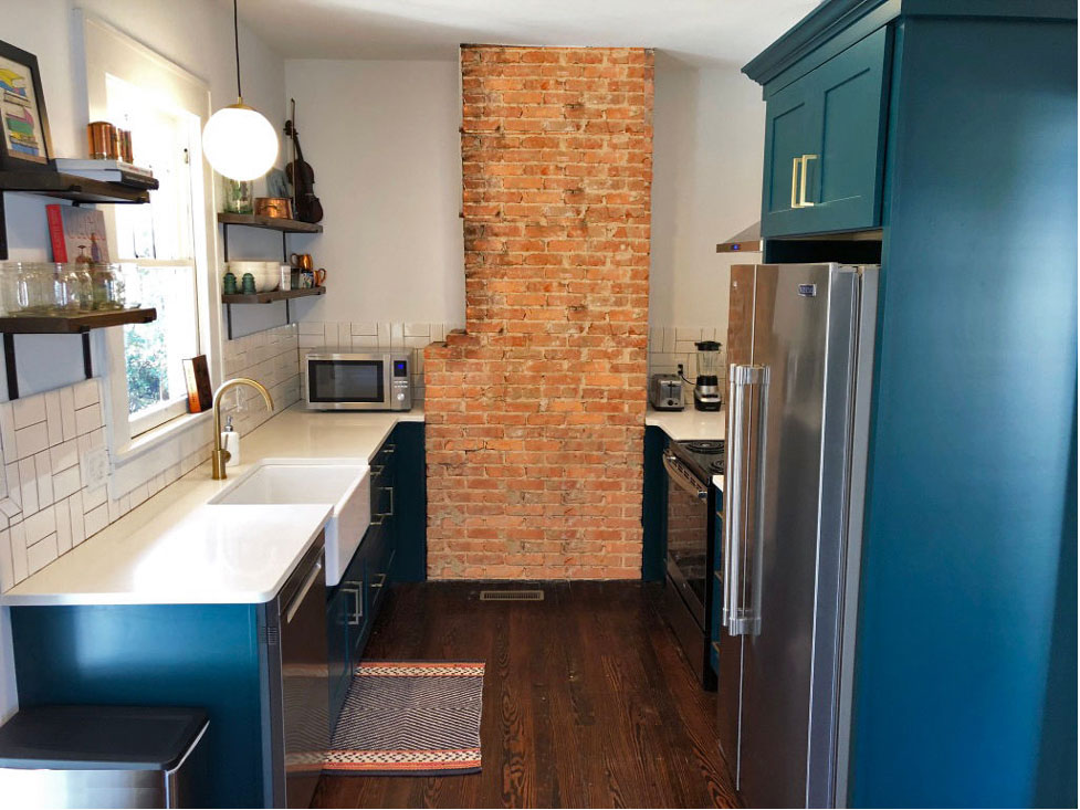
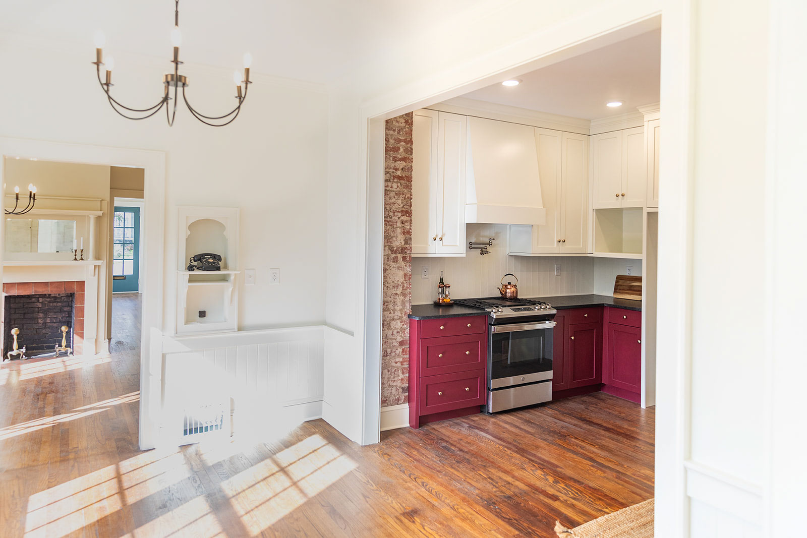
Kitchen
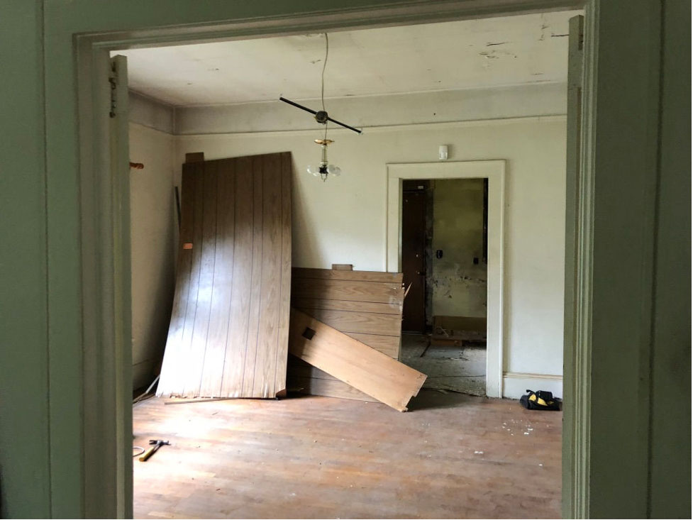
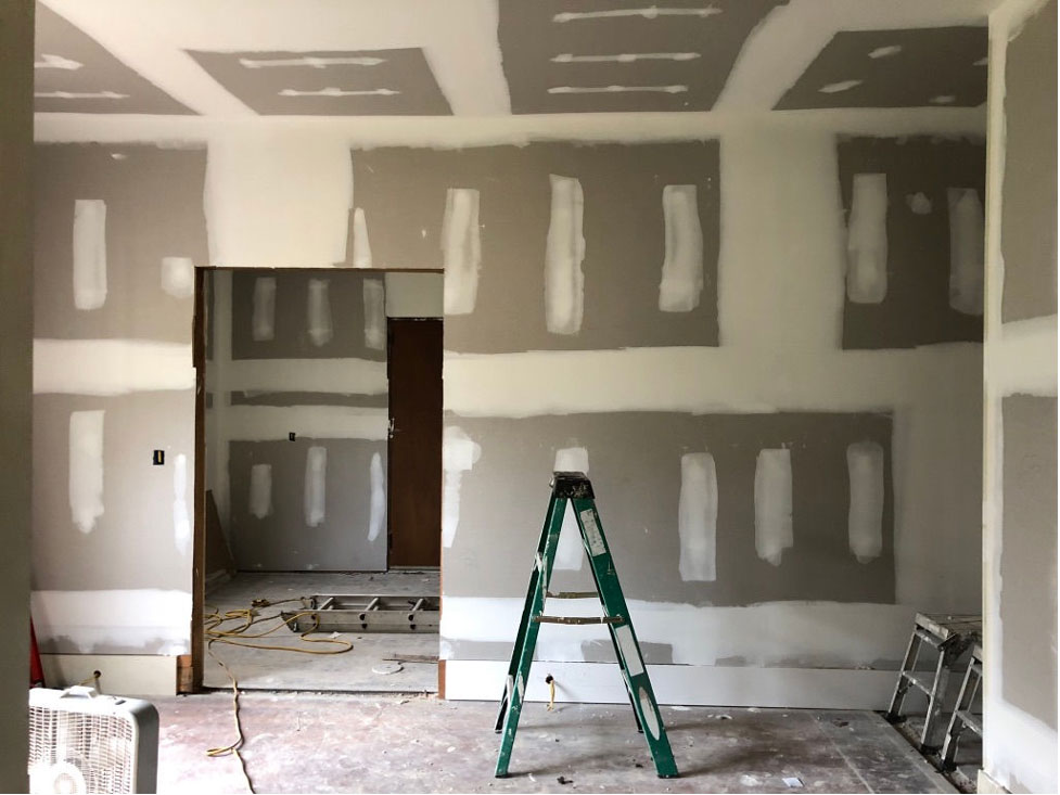
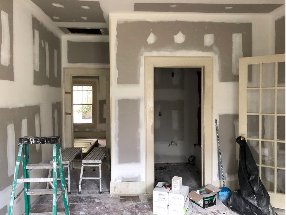
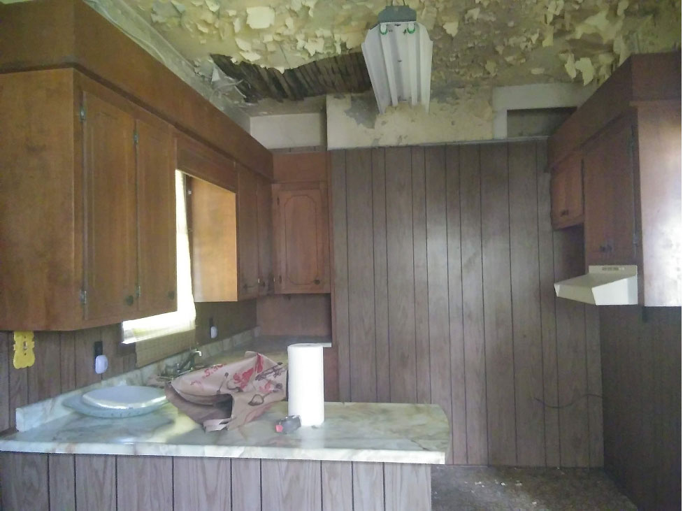
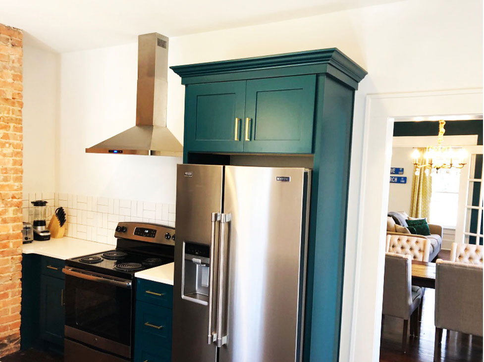
The last space in the ‘entertaining’ side of the house is the kitchen which we completely gutted and redesigned. And listen, there were so many things wrong with this space. There was a dilapidated ceiling, paneled walls, and a dated and dysfunctional kitchen lay-out.
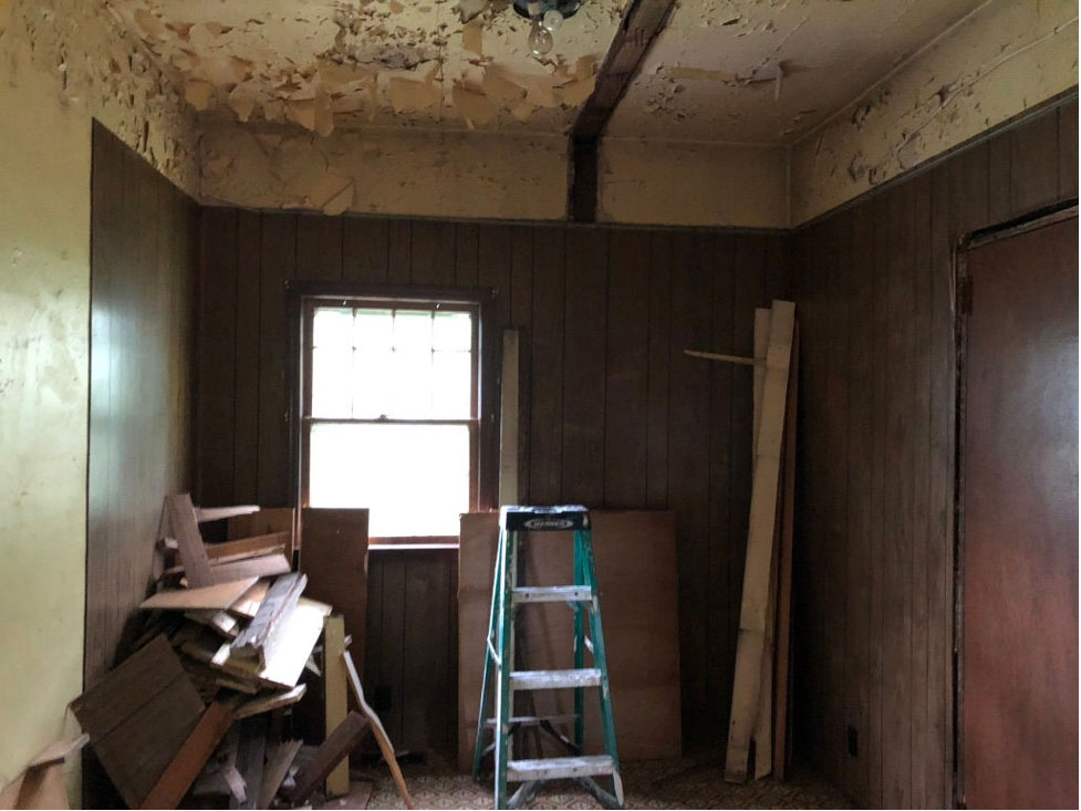
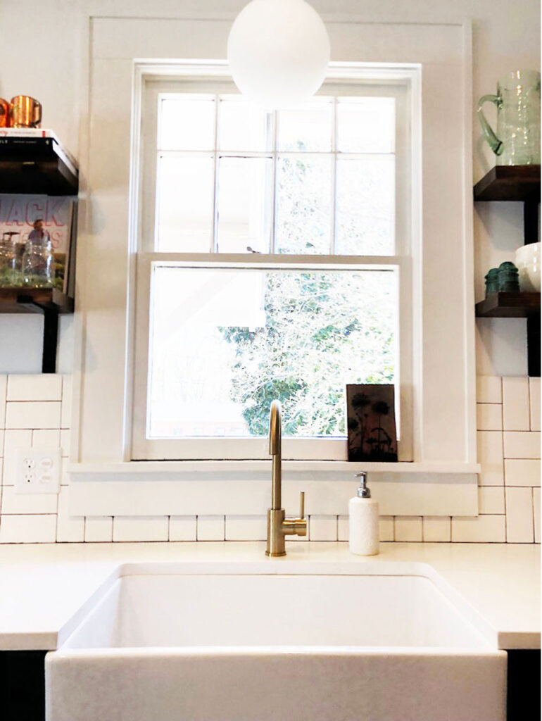
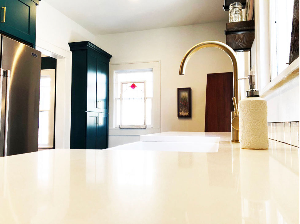
With the dining room doorway moved down slightly, we were able to set up a proper galley kitchen. The stove and refrigerator are on one side and the sink on the opposite wall in front of the window. We also exposed the brick in this space like we did in the living room by removing the plaster.
Here are a couple of screenshots from one of the One Room Design Plans. I used these to help my client visualize how the finished space would look.
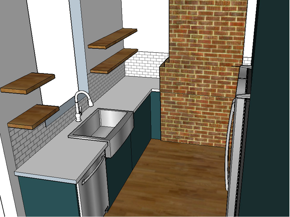
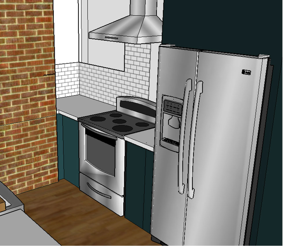
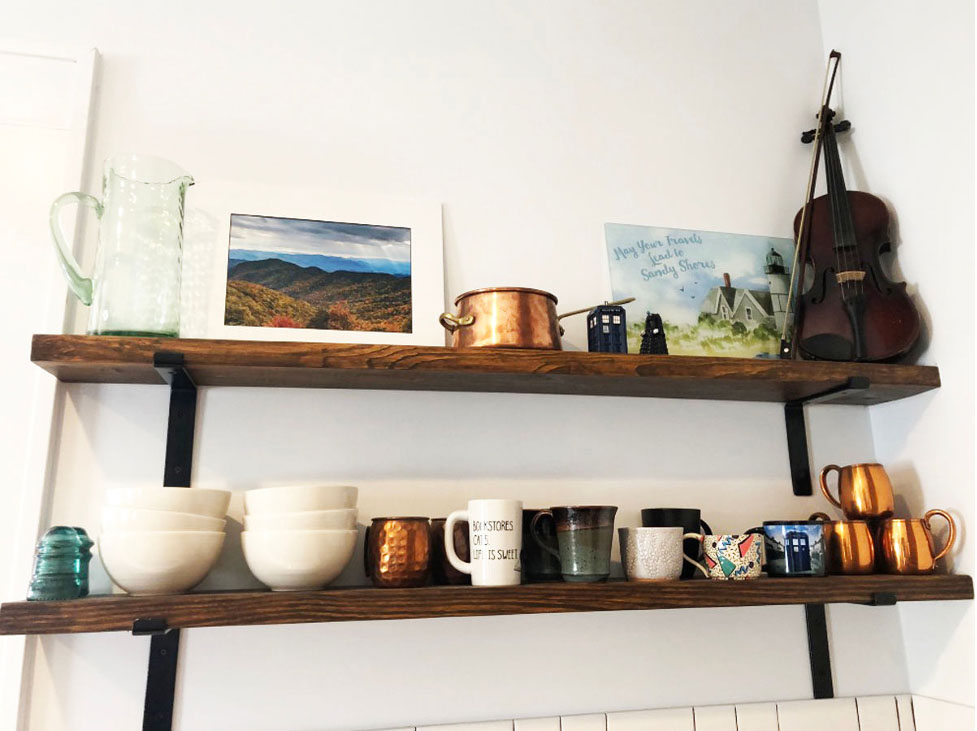
We once again went with the Sherwin Williams Blue Peacock for the cabinets. To compliment the cabinets we used white quartz countertops with a white subway tile with black grout. And last but not least we added brass fixtures and open wood shelving. My client has what I like to call a cool vintage eclectic style and this kitchen certainly compliments her style.
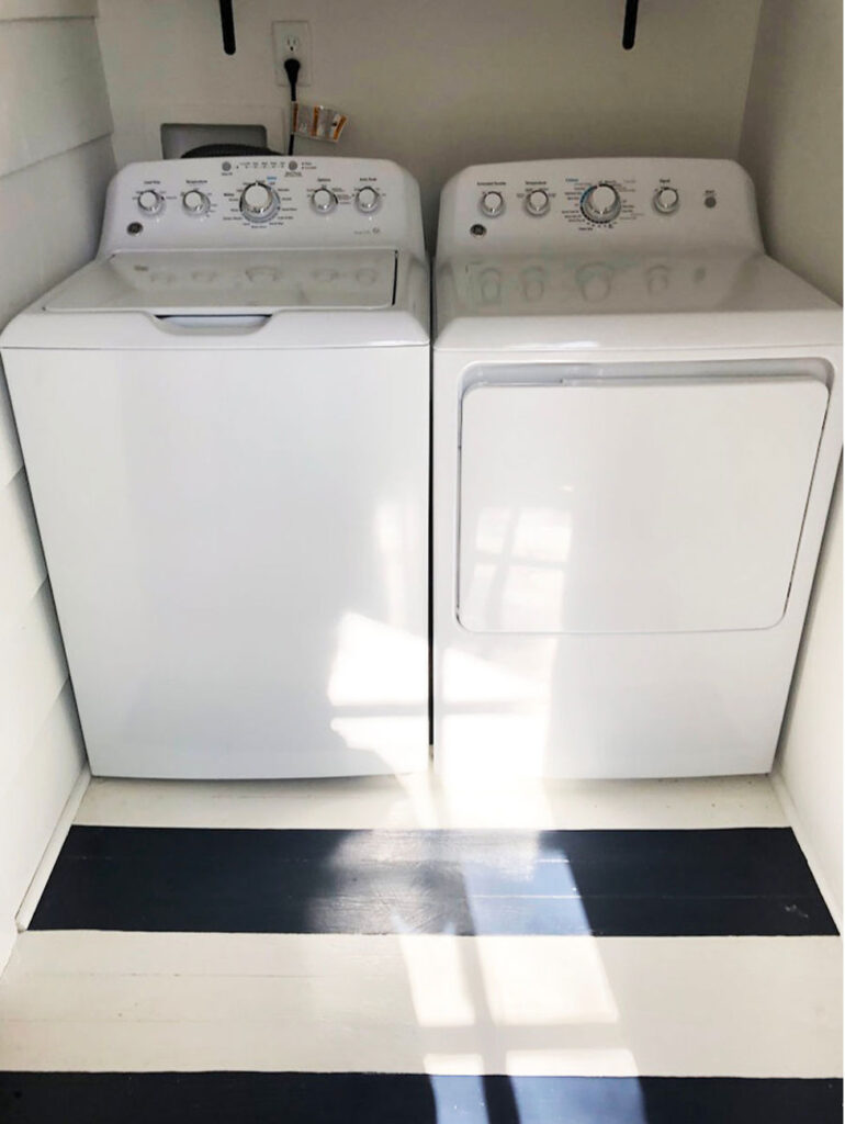
Laundry Room
And last but not least, just off the kitchen is the new location for the laundry room. Originally, this space was a back porch that had been enclosed at some point over the years. Luckily, we had just enough room to fit a washer and dryer so we added insulation, drywall, and painted everything. We then painted the floors a fun navy and white striped pattern.
- In case you missed last week’s post: Banda Bungalow Exterior Transformation
- Interested in having me redesign your home’s floor plan? Head over to our Design Services to see how I can help.
- Look forward to the final reveal of the Banda Bungalow!


+ Show / Hide Comments
Share to: