Banda Bungalow: Exterior Transformation
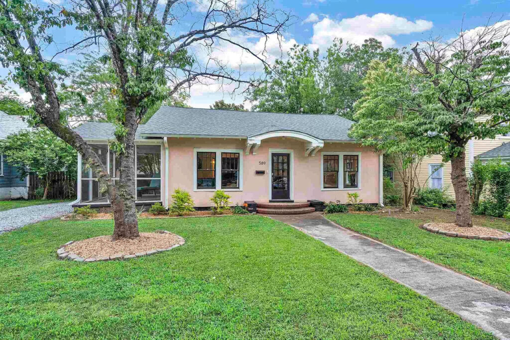
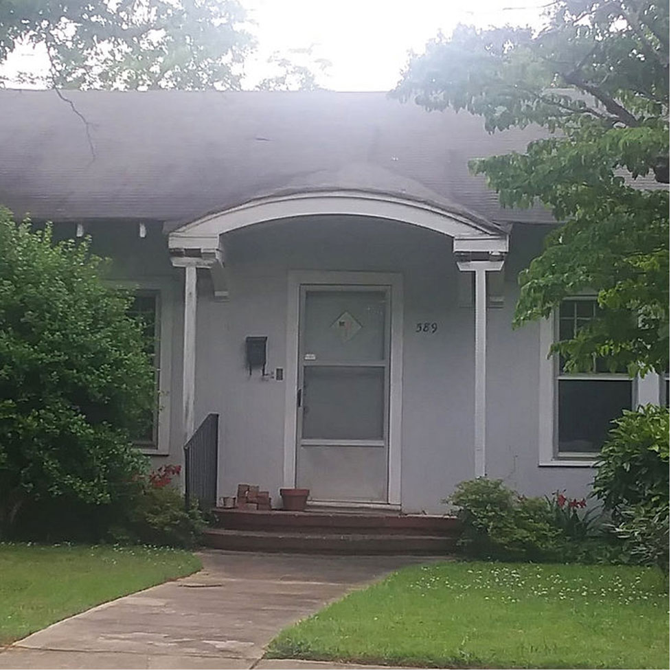
This sweet little house packs a mighty punch despite it’s small size at just under 1200 square feet. I’ve admired the exterior of this house for years both for how quaint it seemed and because of the distinctive arched above the front door. And I had always hoped to renovate it since I lived nearby for years.
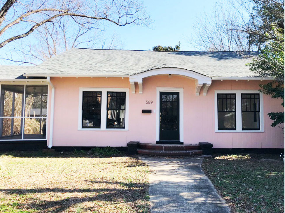
Unfortunately, when it went up for sale the first time I wasn’t in a position to make an offer. However, as luck would have it, I got my chance to be involved. A realtor called me looking for his client a house in Hampton Heights. I knew the new owner of this house had to decided to resale it without having done any renovations. Long story short, I was able to connect them and later got on board to help the new owner, my new client, renovate this house into the home of her dreams.
When we first started our conversations about the lay-out and the design of the house, I’ll never forget that my client told me her mom said to let me know that her design style is more like Home Town than Fixer Upper. That little piece of information stuck with me and helped clearly lay the path for how the finished project should look and feel. As you’ll soon see, she already had some fabulous antique pieces and cool finds to decorate with. We simply needed to make sure the design choices made would allow those pieces to tell her story.
The Exterior
Since Hampton Heights is located in a locally designated historic district, we are limited on the changes that can be made to the exterior of the house. I personally am a huge advocate of these restrictions simply because they are there to protect the character and history of the homes. Since you can do anything you want to the interior, they aren’t nearly as restrictive as some think. The general rule is that you cannot alter anything that you can see from the right of way that is original unless you are restoring it to its former state, which is what we did.
The Three Biggest Changes
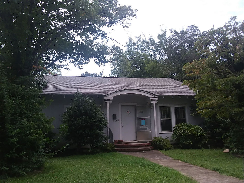
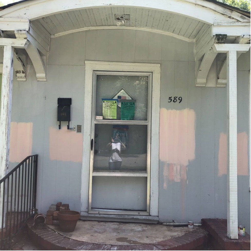
As you can see, the house was dated, the yard was overgrown, and it just looked tired. My client had the yard cleared so that we could get to work on the exterior, including three changes we had permission from the City to make.
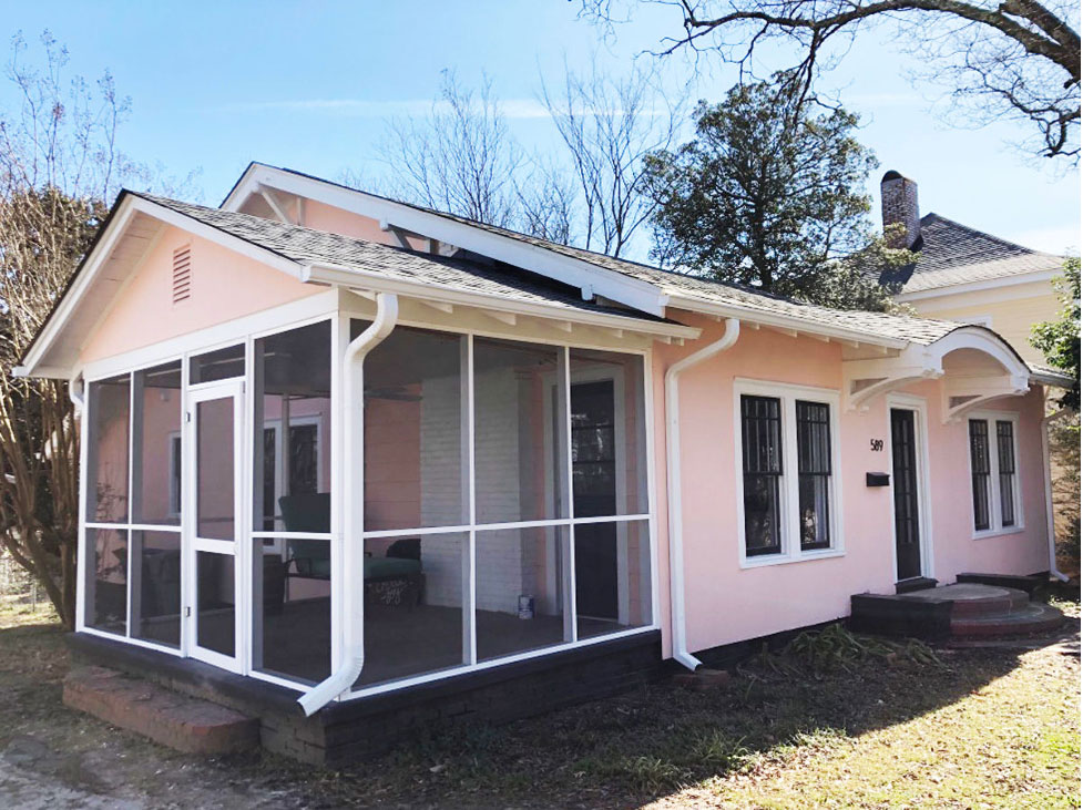
First, we removed the 4×4 posts that had been added at some point underneath the arched overhang as additional support. The guys properly reinforced the eave brackets so that the original open overhang could be restored. Now it also shows off the arched brick steps.
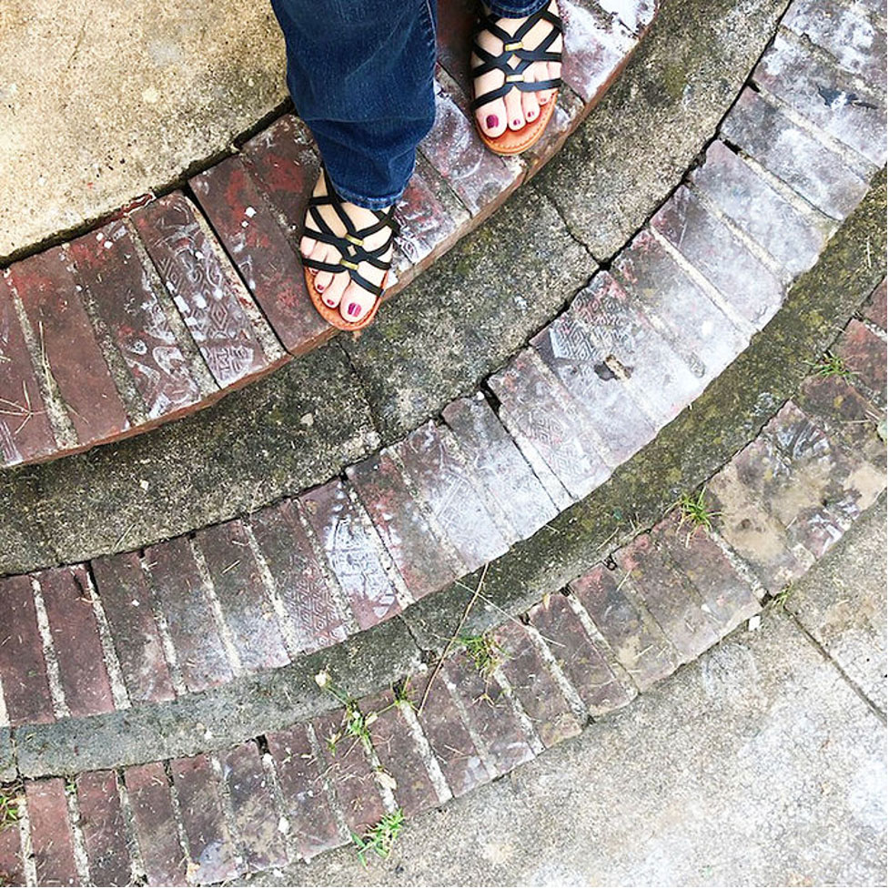
Secondly, since the front door was not original to the house we were able to replace it. Since old house doors are not a standard size, this was not an easy task. My client is super resourceful and found two in Nashville and drove there one weekend just to pick them up. But here’s the thing…..that’s what it takes to restore a historic home. Some things come easier than others but it’s the extra effort that goes a long ways for these old homes. And just look how great the front entry turned out!
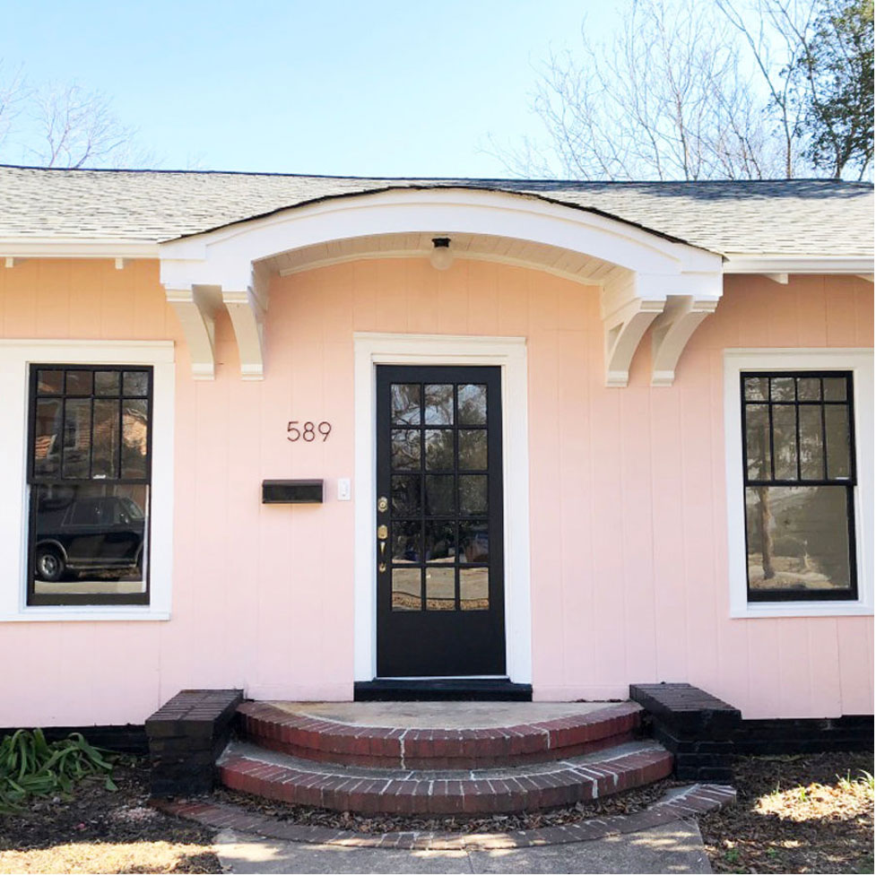
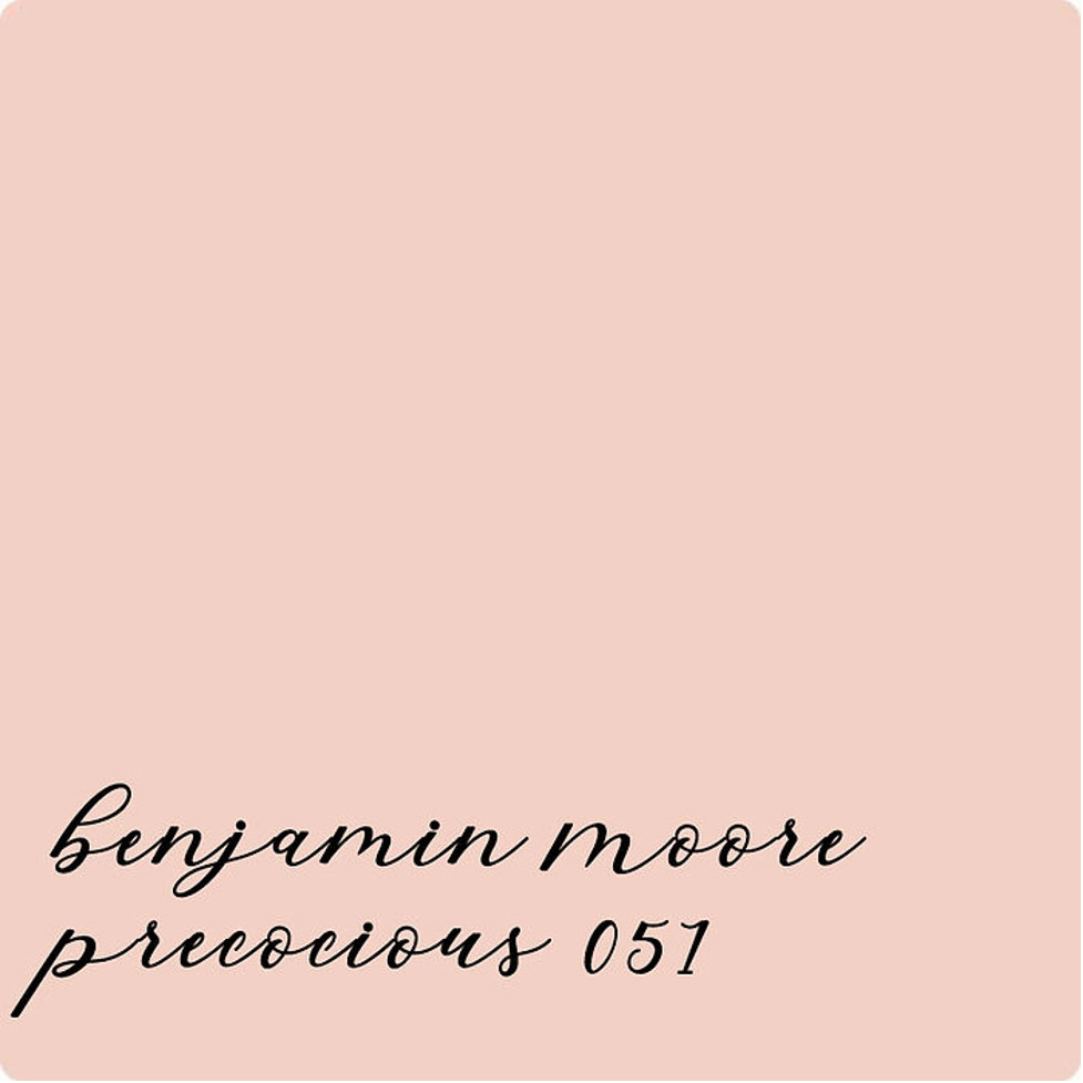
Okay so let me jump in for just a quick minute to state the obvious. In addition to the other changes we’re discussing, we also put on a new roof and painted the exterior this refreshing shade of pink. The body is Benjamin Moore Precocious with bright white trim and black for the doors, window sashes, and foundation.
The original work write up did not include painting the body of the house but rather just the trim. However, that quickly changed so the discussion of what color to pain the house went a little something like this:
Me: So what color are you thinking?
Client: Just something simple.
Me: What about pink? I think that would look really pretty.
Client: No, I’m not really a pink kind of person.
Five minutes later….
Client: Okay let’s go with pink.
Me: Great! I have one sample I’d love to show you. Why don’t you pick out two more and we’ll go from there. Drop them off and I’ll paint them on the house in large samples to look at.
Client: Sounds good…..
So she showed up with four samples, one which was the same as the one I brought, and then two more, and then I lost track. I love to give her a hard time about this but all in good fun. My general rule is to stick with three samples because anything more than that gets confusing. Of course at the end of the day the only person who needs to be happy with the home is the client so if we need to go through 10 more samples, we absolutely would.
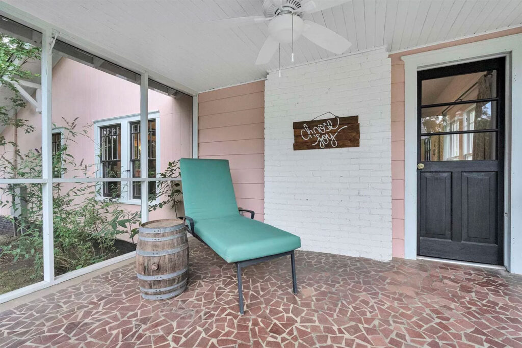
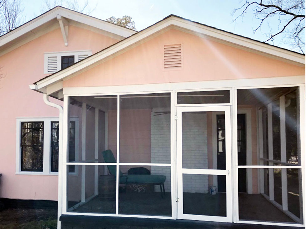
Okay so now on to the last exterior change which was to the screened side porch. While this was just a minor change in terms of the overall renovation, it made a huge difference. We removed some boards along the bottom and screened in the entire porch from floor to ceiling. One of my favorite places to be is outside relaxing on my porch and here in the south screen helps to keep out the mosquitos. We finished off the space with a ceiling fan and I’m sure she’ll love hanging out here this spring.
Our next blog posts will go through the interior of the home walking you through how we changed the floor plan to maximize the square footage including adding a second full bath so be on the lookout for that.

+ Show / Hide Comments
Share to: